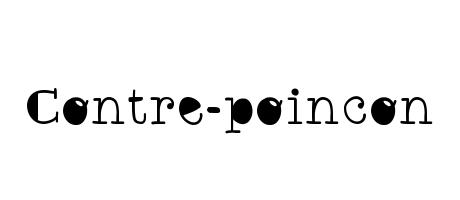
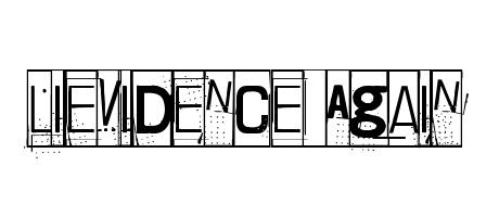
Contre-poincon is a serif typeface, seemingly inspired by vintage printing styles. Its letters are slightly condensed, giving a classic, almost elegant feel. The consistent stroke weight adds a touch of simplicity. The black dots punctuating the word playfully hint at a handcrafted, perhaps even slightly rebellious, spirit.