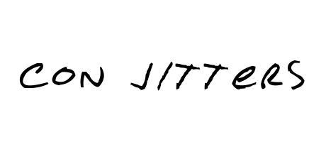
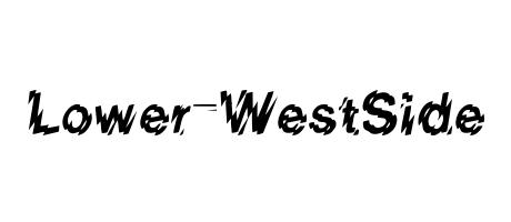
Con Jitters: A font that embodies nervous energy. Its uneven, slightly shaky strokes evoke a sense of urgency and playful chaos. Perfect for headlines needing a jolt of personality, or packaging that wants to convey excitement. A touch of hand-drawn imperfection adds a unique charm.
Con Jitters \u00a9 Starving-4 Entertainment. 2002. This font is licensed under the terms of the Design Science Licence: http://dsl.org/copyleft/dsl.txt