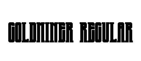
Goldminer Regular: A bold, sans-serif typeface with a strong, almost brutalist aesthetic. Its thick, uniform strokes and condensed letterforms convey power and a slightly retro feel. The letters are tightly spaced, creating a dense and impactful visual. It's a font that demands attention.
! " # $ % ' ( ) * + , - . / 0 1 2 3 4 5 6 7 8 9 : ; < = > ? @ A B C D E F G H I J K L M N O P Q R S T U V W X Y Z [ \ ] ^ _ ` a b c d e f g h i j k l m n o p q r s t u v w x y z { | } А Б ‘ ’ “ ”
Copyright Noah - 10 year old typomaniac 2013\n\u201a\u00c4\u00faGoldminer \u201a\u00c4\u00f9 is based on \u201a\u00c4\u00fa5Goldminer\u201a\u00c4\u00f9 by \u201a\u00c4\u00faNoah - 10 year old typomaniac\u201a\u00c4\u00f9 (http://fontstruct.com/fontstructors/winty5)