What Fonts Work Best for Trade Show Tents and Displays
Typography on a custom canopy tent serves one primary function: instant legibility from a distance. In a crowded exhibition hall, your choice of typeface determines whether an attendee can identify your brand from fifty feet away or if they walk past because your message is a visual blur. Most business owners spend weeks on their logo but only seconds on their font selection, failing to realize that a font is the primary carrier of their value proposition.
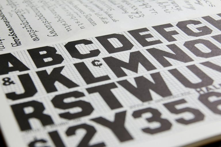
Large-format printing requires different rules than digital or print media. On trade show display booths, fonts must maintain their integrity when scaled up to several feet in height. The most effective fonts share specific characteristics like
- high x-heights
- open counters
- consistent stroke weights.
If the gaps inside letters like “o” or “a” are too small, they will fill in and become solid blobs when viewed from a distance.
The Sans-Serif Standard for Maximum Clarity
Sans-serif fonts are the most effective for outdoor and large-scale displays. They lack decorative tails, which prevents letters from bleeding together when viewed from an angle.
This is particularly important for tent valances, where the fabric might ripple or sag slightly. You need a font that maintains its shape regardless of the medium.
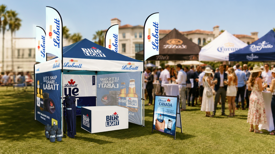
Helvetica is the gold standard for neutral, high-speed processing. Its character spacing is designed for clarity, making it the safest choice for brand names. Gotham is another powerhouse, offering a professional and modern appearance that performs exceptionally well on fabric surfaces.
For brands that want to appear more contemporary or geometric, Montserrat is a top contender. It remains readable even in low-light environments or under the harsh, flickering lights of a convention center.
Utilizing Slab Serifs for Brand Weight
If your brand requires a “heavy” or more industrial look, slab serifs provide the necessary weight without the clutter of traditional serifs. Unlike standard serifs, which have delicate, tapered ends, slab serifs use thick, block-like strokes. This ensures the decorative elements do not disappear into the background when printed on large-scale displays.
Rockwell is a classic choice in this category. Its sturdy shapes make it excellent for headers on valances where you want to project a sense of stability and strength. Arvo is a more contemporary slab serif that balances personality with extreme legibility.
These fonts are ideal when you want to stand out from the sea of minimalist sans-serif designs while still ensuring that your text is not a chore to read.
Why Styles and Weights Can Fail Your Brand
Understanding what works is only half the battle; you must also recognize which styles will actively sabotage your visibility. Decorative, script, and ultra-thin fonts fail in trade show environments.
Script fonts create “visual noise” that the human brain cannot decode quickly at a distance. If a passerby has to stop and squint to figure out if a letter is an “L” or an “E,” they will simply keep walking.
Thin or light-weight fonts are equally problematic. From a distance, thin lines disappear against the texture of the tent fabric or get washed out by bright overhead lighting. You should also avoid condensed fonts, which squash letters together. While they allow you to fit more text into a small space, they destroy legibility. If a font requires effort to read, it is a failure for your marketing.
Transitioning From Style to Visibility: The Role of Contrast
Even the perfect font cannot overcome poor color choices. The best typeface is useless without a high-contrast color palette. For maximum visibility, use light text on dark backgrounds or dark text on light backgrounds.
Avoid vibrating color combinations like red text on a blue background, which creates a halo effect that makes text appear blurry to the eye.
Once you have selected a bold, legible font and paired it with high-contrast colors, you have created a visual anchor. This foundation allows your booth to communicate your message instantly, freeing you up to focus on the human side of the event. A well-designed display does the heavy lifting of introduction, allowing you to move straight into the pitch.