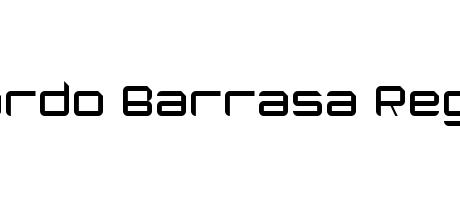
Eduardo Barrasa Regular boasts a bold, geometric sans-serif design. Its chunky, squared-off characters possess a strong, almost robotic presence. The uniform stroke weight creates a sense of solidity and stability, lending itself to titles and impactful statements. The overall feel is modern, clean, and undeniably confident.
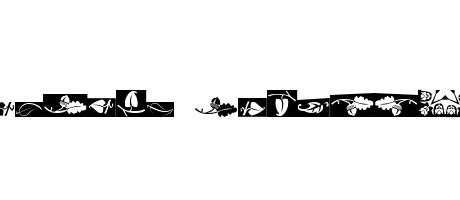
! " # $ % & ' ( ) * + , - . / 0 1 2 3 4 5 6 7 8 9 : ; < = > ? @ A B C D E F G H I J K L M N O P Q R S T U V W X Y Z [ \ ] ^ _ ` a b c d e f g h i j k l m n o p q r s t u v w x y z { | } ~ ‘ ’ “ ”