Typography Inside AI-Generated Images: Why It Finally Works, and How Designers Are Using It
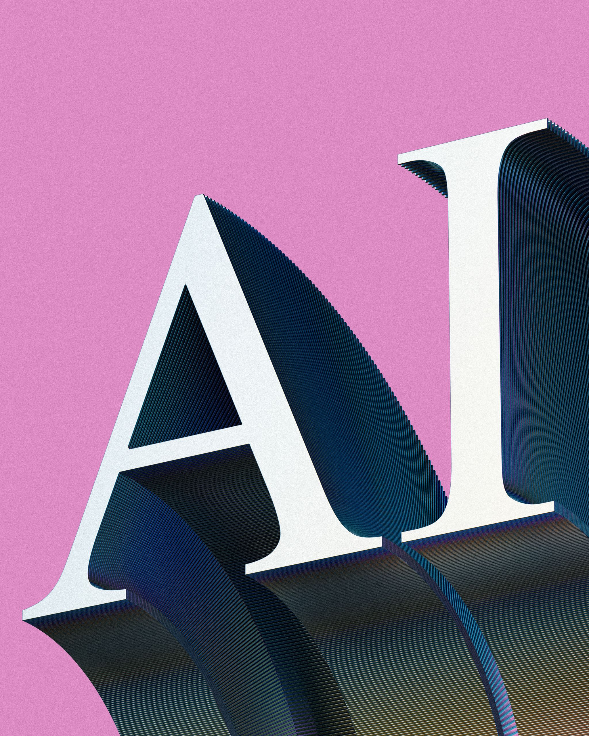
For two years the reliable way to spot an AI-generated image was to look for text. Signage read like a fever dream, product labels dissolved into pseudo-Latin, and any poster mockup needed the type stripped out and rebuilt by hand. That single failure kept generative imagery out of a large slice of professional design work — because a startling share of commercial visuals contain words.
What Changed in the Model Generation
The current wave of image models handles typography at a fundamentally different level. Ask for a conference poster with a legible agenda, a storefront sign with a real business name, or a UI mockup with actual button labels, and the words come back spelled correctly and kerned plausibly. The improvement came from better text encoders and training data that treats glyphs as glyphs rather than as texture.
OpenAI’s latest image model is the clearest example of the shift. In practice, teams report that short headline-length strings now render correctly the large majority of the time, and that multi-line body copy — still the hardest case — is usable often enough to draft with. That is the threshold at which a tool moves from novelty to workflow.
Where This Actually Lands in Design Work
Three applications have absorbed most of the adoption. Comping is the biggest: art directors generate fully-typeset concept boards in minutes to test a direction before committing a designer’s day to it. Social variants come second — a campaign key visual regenerated with different headline copy for a dozen markets, where previously each localisation was a manual layout pass. And packaging and signage mockups are third, where the ability to place readable product names on a shelf render collapses a step that used to involve 3D software.
Access has commoditised alongside the capability. Rather than subscribing to each lab individually, most design tools now reach models through aggregation layers — the GPT Image 2 API is available through a unified endpoint alongside competing image models, with per-generation pricing published openly, which is why a small studio can A/B two models against the same brief for the cost of a coffee.
The Craft Caveat Every Designer Should Keep
Generated typography is now good enough to fool a casual viewer and still not good enough to ship unexamined. Letterforms occasionally drift from the intended typeface, tracking can wander mid-line, and diacritics in non-English languages remain unreliable. The professional workflow that has settled in reflects this: generate the scene, then rebuild the type as a proper layer in your layout tool, using the generated version purely as a composition guide.
That approach also protects brand consistency. No model reproduces your licensed typeface exactly, and a headline set in something that merely resembles your brand font is a subtle failure that a client will eventually notice.
A Practical Test Worth Running
If you want to calibrate where these tools sit for your own work, take a finished piece from your portfolio and try to regenerate its key visual — same mood, same composition, same headline. Count how many attempts it takes to get something you would show a client as a concept. Most designers land somewhere between three and eight, which tells you the real cost is not the generation fee but the curation time. Knowing that number for your own aesthetic is more useful than any benchmark chart.
The larger point for anyone working with type: the barrier that kept generative imagery out of typographic work has fallen, but the judgment about what deserves to be set, in what voice, at what size, has not moved an inch. It never does.