Designing Chinese Text Across Desktop and Mobile Interfaces: A Practical Typography Guide
Designing Chinese Text Across Desktop and Mobile Interfaces: A Practical Typography Guide
Designing a multilingual interface is not as simple as replacing one language with another.
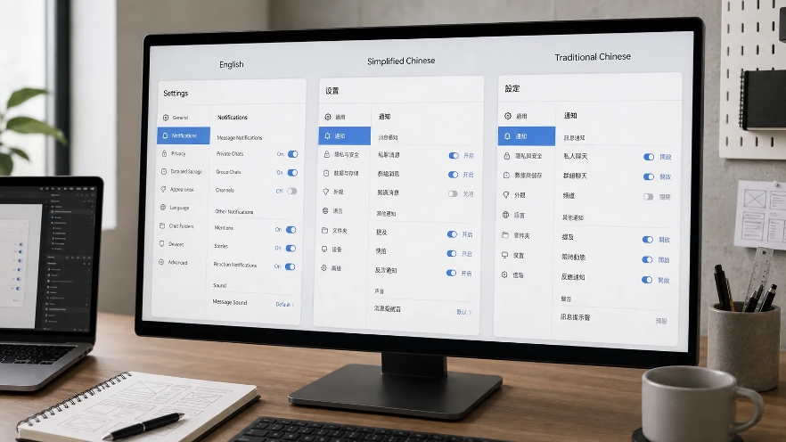
A layout that looks balanced in English can become noticeably denser when translated into Simplified or Traditional Chinese. Navigation labels may change length, fallback fonts can alter visual weight, and line breaks that feel natural in Latin text may behave very differently with Chinese characters.
These differences become especially visible in communication applications, where sidebars, settings, notifications, message lists, timestamps, file names, and conversation text often appear on the same screen.
For designers working across desktop and mobile environments, Chinese localization therefore requires more than translation. It requires a typography system that can adapt to different scripts, devices, and interface densities without sacrificing clarity.
Chinese Typography Is Not Just English Typography With Different Characters
Latin and Chinese writing systems have different visual structures.
Latin typefaces are usually discussed in terms of x-height, ascenders, descenders, cap height, and letter spacing. Chinese characters occupy a more square-shaped visual space and often contain significantly more internal detail.
As a result, applying exactly the same font size and line height to both scripts does not always produce equal visual weight.
For example, an English interface using 16-pixel body text with a 24-pixel line height may feel comfortable and open. The same numerical values in a dense Chinese interface may appear heavier because each character occupies more visual area.
Designers should evaluate perceived character density, stroke weight, line height, spacing between interface groups, contrast between headings and body text, and the relationship between Chinese and Latin characters.
Numerical consistency is useful, but optical consistency matters more. A multilingual design system should therefore define how each script feels on screen rather than simply forcing all languages into identical measurements.
Simplified and Traditional Chinese Need Separate Testing
Simplified and Traditional Chinese are closely related, but they should not be treated as visually interchangeable.
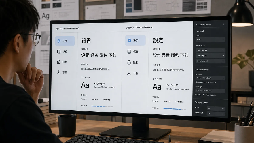
Some words use different glyph forms, while interface terminology can also vary by region. For example, Simplified Chinese may use 设置, 设备, 隐私, 下载, while Traditional Chinese may use 設定, 裝置, 隱私, 下載.
Even when the number of characters remains similar, the stroke complexity can change the overall texture of the interface. Traditional Chinese characters may appear visually denser because many glyphs retain more strokes. This difference becomes particularly noticeable in compact navigation areas, settings menus, and small mobile screens.
Interface localization becomes especially visible in messaging applications, where navigation labels, settings, and conversation text appear together on relatively dense screens. Users comparing a Telegram 中文版 interface, for example, may encounter different terminology and glyph forms depending on whether the localization uses Simplified or Traditional Chinese.
For designers, this means both versions should be tested independently. A layout that works well in Simplified Chinese should not automatically be assumed to work equally well in Traditional Chinese.
Font Fallback Can Change the Entire Interface
One of the most important parts of multilingual typography is font fallback.
A design may specify a preferred Latin font, but if that typeface does not contain Chinese glyphs, the operating system or browser will substitute another font.
That substitution can change stroke weight, character width, vertical alignment, punctuation appearance, line height, and overall tone.
A common CSS stack might include both Latin and CJK fonts, followed by a system fallback. For example, a designer might combine a Latin interface font with system fonts such as PingFang SC, PingFang TC, Microsoft YaHei, or a Noto Sans CJK family.
The exact stack will depend on the platform and the project’s licensing requirements, but the principle remains the same: fallback should be planned rather than left to chance.
Unexpected fallback can make a polished interface feel inconsistent. A button label may suddenly appear heavier than the English text beside it. A Chinese sentence may sit slightly higher or lower than surrounding numbers. Punctuation can also look different enough to disrupt visual rhythm.
Designers should test the complete font stack on real operating systems rather than relying only on a design mockup.
Mixed English and Chinese Text Needs a Consistent Rhythm
Many interfaces are not entirely Chinese or entirely English. A settings screen might include Telegram Desktop, Windows, macOS, 通知, 隱私與安全, Devices, and 版本資訊.
This type of mixed-script interface is common in Hong Kong and Taiwan, where English product names often remain untranslated.
The challenge is maintaining visual rhythm between the scripts. Latin capitals can appear smaller than nearby Chinese characters even when both use the same numerical font size. Font weight may also feel inconsistent if the Latin and Chinese typefaces are drawn differently.
Designers should check baseline alignment, apparent text size, weight balance, spacing around Latin words, punctuation behavior, and number alignment.
Product names, operating-system labels, dates, URLs, and technical terminology should be included in testing content from the beginning. A typography system that looks excellent with placeholder English text can still fail once realistic bilingual content is introduced.
Desktop Interfaces Create Different Typography Problems
Desktop interfaces provide more space than mobile screens, but they also display more information at the same time.
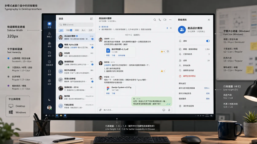
A desktop communication interface may contain conversation lists, navigation sidebars, message panes, search fields, file names, timestamps, group titles, and settings panels. Each area may use a different type size or hierarchy.
That density makes typography consistency particularly important.
Desktop messaging interfaces are a useful example because several layers of text often appear at once. Looking at layouts associated with 电报电脑版, designers can see why Chinese localization must account for sidebar widths, message density, navigation labels, and larger multi-column layouts rather than simply scaling up a mobile interface.
On desktop, a poor font choice can make an entire sidebar feel crowded. Excessive line height can reduce the number of conversations visible at once, while insufficient spacing can make individual items difficult to scan.
The challenge is therefore different from mobile design. Desktop typography needs to support high information density without making the interface feel compressed.
Mobile Screens Make Chinese Line Breaking More Visible
Mobile layouts have less horizontal space, which makes line-breaking behavior more important.
English text usually wraps at spaces between words. Chinese text does not depend on spaces in the same way, so line breaks can occur between characters.
This can be efficient, but it also introduces several design considerations. Designers should pay particular attention to punctuation at line starts or ends, numbers mixed with Chinese text, English product names inside Chinese sentences, URLs, emoji, long file names, dates, and times.
A narrow mobile screen can produce awkward combinations when English words or technical labels appear inside Chinese text. For example, a phrase containing a long product name may leave large gaps or create an unbalanced final line.
Testing with realistic content is essential. Designers should avoid evaluating mobile typography with perfectly short placeholder strings. Real users will create much less predictable text.
Buttons and Navigation Need More Than Translation
Fixed-width controls can easily break in multilingual interfaces.
A button designed around the English word “Privacy” may need to display a longer localized phrase such as “隱私與安全.” Likewise, a navigation label that fits neatly in English may become visually crowded when translated.
The safest approach is to allow components to adapt. Useful strategies include flexible button widths, appropriate horizontal padding, responsive navigation containers, minimum rather than fixed widths, truncation only where necessary, tooltips for shortened labels, and multi-line labels when the interface can support them.
Translation should not be forced into a component that was designed only for English. The component itself should be designed for language variation.
This becomes especially important in settings pages, where several related controls may be aligned in columns. A single longer label can otherwise disrupt the entire layout.
Responsive Typography Should Consider More Than Screen Width
Responsive design often focuses on viewport size, but multilingual typography adds another variable: script density.
A 14-pixel label may be readable in English but feel too dense when rendered in a complex Traditional Chinese typeface on a high-resolution mobile screen.
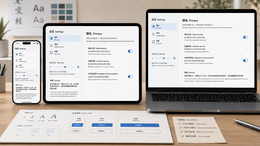
Likewise, a desktop interface may support slightly smaller text because users sit closer to a large display, while a mobile interface may need more generous line height for touch-driven reading.
Designers should therefore evaluate typography across combinations of screen size, pixel density, operating system, script, font family, and interface density. Breakpoints alone cannot solve these issues. The typography system should respond to both the device and the content.
Test Typography on Real Devices
Static mockups are useful, but they cannot reproduce every aspect of real rendering.
Font smoothing differs between Windows and macOS. Mobile operating systems use different default fonts. Browser rendering can also affect weight and spacing.
A practical testing matrix might include a Windows laptop, macOS laptop, large external monitor, Android phone, iPhone, and tablet.
Designers should inspect both Simplified and Traditional Chinese where relevant. Testing should include actual interface content rather than only sample paragraphs.
Useful scenarios include long conversation names, settings labels, bilingual messages, file attachments, dates and timestamps, notifications, system warnings, and search results.
The goal is to identify problems before they reach production. Typography bugs are often small individually, but many small inconsistencies can make an interface feel unfinished.
Accessibility Matters in Chinese Interfaces Too
Typography is not only a visual-design issue. It directly affects accessibility.
Very light font weights may look elegant on a high-resolution display but become difficult to read for users with reduced vision.
Dense Chinese characters are especially vulnerable to this problem because thin strokes can lose definition at smaller sizes.
Designers should pay attention to minimum readable font sizes, sufficient contrast, line height, font weight, text scaling, zoom behavior, and clear hierarchy.
Interfaces should also remain usable when users increase system text size. If a layout breaks as soon as text becomes larger, the design is too dependent on fixed dimensions.
Accessibility testing should therefore be included in the multilingual typography workflow rather than treated as a final adjustment.
Build a Multilingual Type System, Not Individual Screens
The most efficient solution is to define multilingual typography at the design-system level.
Instead of fixing problems screen by screen, teams can establish rules for heading scales, body text, metadata, navigation labels, button text, Chinese fallback fonts, Latin fallback fonts, line-height ranges, component padding, and responsive behavior.
This creates consistency across the entire product.
Designers and developers should also document how the system behaves when Chinese and English appear together. For example, the design system can define which font handles Latin characters in a Chinese interface, how bold weights should be mapped, and what happens when a label exceeds its expected length.
These decisions reduce repeated discussion and make future localization work faster.
Typography Is Part of Localization, Not Decoration
Chinese localization is often discussed in terms of translation accuracy, but typography is just as important to the final experience.
Users notice when text feels cramped, when fonts change unexpectedly, or when navigation labels no longer fit comfortably.
A successful multilingual interface should feel intentionally designed in every supported language.
That requires testing Simplified and Traditional Chinese separately, planning font fallback, accounting for mixed scripts, adapting components to real text lengths, and evaluating typography on both desktop and mobile devices.
The goal is not to make Chinese interfaces look exactly like their English equivalents. It is to preserve the same level of clarity, hierarchy, and usability across scripts.
When typography is treated as part of the localization system rather than a decorative layer, multilingual products become easier to read, easier to navigate, and more consistent across every screen.