AI Manga Generators and the New Rules of Typography
Typography has always been the quiet workhorse of comics. Long before a reader processes the art in a panel, the lettering sets the tone: jagged display type for an action scene, delicate serif flourishes for a confession between two characters, rounded hand lettering for a Sunday strip. So when AI manga generators arrived, most of the conversation focused on the artwork. The typographic side of the craft has been discussed far less, and that is a missed opportunity, because anyone who works with fonts, downloads them, pairs them, or designs them has a stake in what is happening.
The workflow that changed
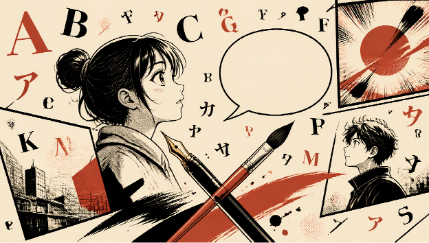
A traditional manga page demands dozens of decisions before a single balloon is lettered. You sketch the panel layout, ink the lines, apply screentone, then choose how every line of dialogue sits inside the art. Tools like the AI漫画生成 generator compress that pipeline into something closer to art direction. You describe the scene, pick a style that ranges from shonen boldness to shoujo delicacy, and the system assembles panels, tones, effect lines, and speech balloons on its own.
What does that mean for type? It means the AI is already making typography choices for you. Balloon shape, letter size, and text density all influence how a page reads, and the generator balances those elements automatically. For designers, this is worth paying attention to, because AI assisted creation is quickly becoming the default starting point for a huge number of visual projects.
Why fonts still decide whether a manga page works
Here is the part AI has not replaced. A generated manga page is a framework, and the creator still decides what the finished piece communicates. Fonts are a huge part of that final layer.
Consider three projects built from the same generated page:
- A webcomic posted to social media, where a rounded, casual display face signals humor.
- A doujinshi for a convention, where hand lettering styles carry the warmth of indie publishing.
- A brand campaign that borrows manga aesthetics, where a geometric sans serif keeps the look modern and controlled.
The artwork can stay identical while the typography pulls each version into a completely different genre. That is why font libraries keep growing even as generation tools improve. The more images people can produce quickly, the more valuable distinctive type becomes as a differentiator.
Practical pairing advice for AI generated pages
If you are generating manga style pages and then adding your own type, a few principles go a long way.
Match the lettering to the panel rhythm
Fast action sequences read best with condensed, energetic faces that echo the vertical speed lines. Quiet dialogue scenes give you room for wider letterforms. AI panels often pack a lot of detail into small areas, so give the lettering breathing room rather than shrinking it to fit.
Treat tone effects as texture, not decoration
Generators place screentone and effect lines automatically, which means your font competes with built in visual texture. A slightly heavier weight usually survives that competition better than a hairline script. Test your type against a busy panel before committing to it across a whole chapter.
Keep a consistent character voice
Readers recognize characters partly through how their dialogue is set. If your generator outputs several pages per session, standardize one face per character and adjust size only. Consistency does more for readability than any decorative flourish.
Where the two toolchains meet
The smartest workflows treat generation and typography as separate crafts that hand off to each other. Generate the visual framework with AI, then make deliberate type choices on top. Creators who describe a scene once and produce several stylistic variants can test which font mood fits best across all of them, something that would have taken a lettering artist days to mock up manually.
There is also a licensing angle worth flagging. Many generation tools, including the one mentioned above, allow commercial use of their output, which makes them viable for client work, printed goods, and serialized publishing. But commercial use of AI images does not automatically cover the fonts you layer on top. Free for personal use faces and commercial licensed faces look identical to a casual viewer, and mixing them up creates real legal exposure. Font sites exist precisely because checking a license takes less time than settling a dispute.
What this means for font designers
If you design type, AI manga generation is less a threat and more a new surface area. Every generated page is a canvas waiting for lettering, and the creators producing those pages in volume are exactly the audience that font marketplaces have always served. The demand is shifting toward:
- Faces that perform at small balloon sizes without losing personality.
- Display styles that can carry a cover even when the interior art is generated.
- Multilingual sets, since manga creation is increasingly global and many creators mix Latin text with Japanese sound effects.
The tools that generate the art will keep improving, and that is fine. Lettering and type selection are where a creator’s taste becomes visible, and taste is not something a prompt captures. Ten creators using the same generator will still need ten different typographic voices.
Building a small manga ready font kit
Because generated pages arrive in volume, it pays to keep a compact font kit prepared instead of hunting for a face every session. A kit of four or five fonts covers nearly every manga adjacent project.
A bold display face for titles and impact lines. This is the voice of the cover and the chapter opener. Heavy weights with slightly condensed proportions survive busy generated backgrounds better than wide, airy designs.
A rounded medium for dialogue. Most generated balloons hold short sentences, so the lettering needs to stay friendly at small sizes. Rounded terminals keep the tone light, which matches the majority of generated manga aesthetics.
A neutral sans for captions and credits. Narration boxes, sound effect translations, and production credits need a face that stays out of the way. Save the personality for the display layer.
One expressive wildcard. Horror projects, retro comedies, and dramatic monologues each reward a distinctive face. Keep one or two character rich fonts on hand for the projects that break the mold, and accept that they will suit only a fraction of your output.
Rotating through a prepared kit also teaches you something valuable over time. You start noticing which faces pair successfully with which generated styles, and that pattern library becomes instinct. Six months into the workflow, you will look at a freshly generated page and know within seconds which two fonts to audition, which is exactly the kind of judgment that makes the fast pipeline feel deliberate rather than automated.
The takeaway
AI manga generation removes the mechanical barriers that kept potential storytellers away from the medium. It does not remove the communicative decisions that make a page feel finished, and typography remains one of the loudest of those decisions. Creators who pair fast generation with deliberate font choices get the best of both sides: the speed of automation and the identity that only type provides.
The pipeline is yours to design. Let the generator handle the panels, and let typography do what it has always done, which is to tell the reader how to feel about what they are seeing.