Why Font Choice Is a Trust Signal on Moving and Logistics Platforms
When you’re handing a removal company the keys to everything you own, you make a trust judgment faster than you probably realise. Before you read a single review or check an ABN, you’ve already formed an impression from how the website looks. And a significant part of that impression comes from something most people couldn’t name if you asked them: the typography.
Font choice is a trust signal. Not a decoration. Not a finishing touch. A signal that communicates — at a speed below conscious awareness — whether a business is professional, reliable, modern, or worth trusting with something important. In an industry like moving and logistics, where the stakes of the transaction are high and the customer is inherently vulnerable, that signal matters more than in almost any other sector.
Here’s what the research says, and what it means for how logistics and moving platforms actually look.
The Research on Fonts and Trust Is Clearer Than You’d Expect
Font psychology has been studied seriously for decades, and the findings are consistent enough to be actionable. The core principle is processing fluency: fonts that are easy to read and contextually appropriate create a positive emotional response and increase trust, while fonts that feel mismatched or hard to parse do the opposite.
Research from Wichita State University found that serif fonts — those with the small strokes at the ends of letters, like Georgia or Garamond — convey tradition, respectability, and reliability. Sans-serif fonts like Helvetica, Inter, or Lato read as modern, clean, and approachable. Neither is universally better. The question is which signals match what the brand needs to communicate. A Monotype and Neurons neurodesign study found that typeface choice alone boosted positive emotional response by up to 13% — significantly higher than the 0–5% typically seen in comparable stimulus tests.
For logistics and moving platforms, the relevant trust signals cluster around three things: professionalism, clarity, and approachability. The font choices on a platform communicate all three before a user has engaged with any content.
Why Trust Is Especially High Stakes in Moving and Logistics
Most industries benefit from trust signals in their visual design. Moving and logistics need them more than most, for a specific reason: the customer is making a high-stakes commitment based on limited information.
You can’t test a removal company before you hire them. You can read reviews, but reviews can be gamed. You can check credentials, but most people don’t know exactly what to look for. What you can do, immediately and unconsciously, is make a visual judgment about whether a platform looks like the kind of operation that knows what it’s doing.
A platform with inconsistent typography, fonts that clash, or typefaces that feel informal or amateurish communicates something specific: this business hasn’t thought carefully about how it presents itself. And if it hasn’t thought carefully about that, the mental leap to ‘will it think carefully about my furniture?’ is short.
The reverse is also true. A platform with a clean, consistent, professionally chosen typeface communicates that someone has thought about the details. That signal extends — again, mostly unconsciously — to assumptions about how the company operates overall.
What Good Typography Looks Like on a Logistics Platform
The most effective moving and logistics platforms tend to use clean sans-serif typefaces for body text and UI elements — Inter, Lato, and similar geometric sans-serifs that are highly readable on screens at small sizes, convey clarity, and feel neither cold nor casual. These fonts work because they match the brand promise: efficient, modern, straightforward.
Headings are where platforms have more room to express character. A slightly heavier weight, a more distinctive typeface, or even a subtle serif in the heading can add personality without sacrificing readability. What causes problems is inconsistency — multiple typefaces fighting for attention, decorative fonts used in body copy, or typefaces that feel out of register with the service being offered.
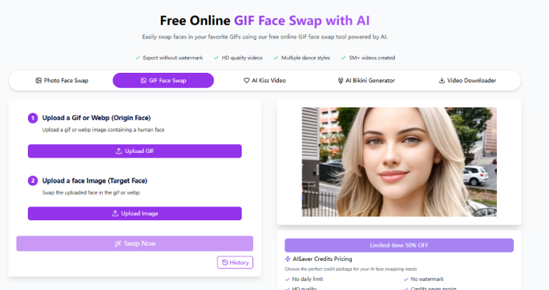
An Australian wide home removalists platform like FindaMover operates in a space where the immediate impression of professionalism and reliability directly affects whether a user will submit their details or bounce. That first impression is shaped before any content is read. The typography either earns that moment or loses it. The platforms that convert well in this space tend to use typefaces that signal efficiency without coldness — clean, readable, professional, but not sterile.
The Problem With Looking Like Everyone Else (And the Problem With Not)
There’s a specific tension in logistics typography that’s worth naming. The category has converged on a certain visual language — blue and white colour schemes, sans-serif type, clean layouts — because it works. It communicates reliability and professionalism, which is what the category needs.
But convergence creates its own problem. When every platform in a category looks roughly similar, differentiation becomes harder. A platform that looks professional but indistinguishable from its competitors hasn’t used design as a competitive advantage. It’s used it to meet a baseline.
The smarter approach is differentiation within the trust register — choosing a typeface that signals professionalism but has enough personality to be memorable. A distinctive but readable geometric sans-serif in a heading, used consistently, creates recognition without sacrificing credibility. The risk of going too far in the other direction — trying to stand out with display fonts, script typefaces, or decorative choices — is that it breaks the trust signal the category depends on.
A vehicle transport service like VehicleMove is dealing with a customer who is trusting them with a car that might be worth tens of thousands of dollars. The typography on that platform needs to communicate precision and care. A font that feels hasty, generic, or inconsistent works against the core brand promise even if every other element of the service is excellent.
Weight, Spacing, and the Signals People Don’t Know They’re Reading
Typography is more than font family. Weight, letter-spacing, line-height, and contrast all contribute to how a platform reads and how it feels. And these elements communicate at the same unconscious level as the typeface choice itself.
Heavy weights signal strength and confidence. Used well in a heading on a logistics platform, they communicate that the company is capable and established. Used poorly — too heavy throughout, creating visual heaviness that strains reading — they signal aggression or clumsiness.
Generous line-height and letter-spacing in body text communicate calmness and transparency. Cramped text, even in a perfectly chosen typeface, signals a company trying to pack too much in — which reads as either disorganised or as a company hiding something in the fine print.
Contrast between heading and body weights — a clear visual hierarchy — makes a platform easier to navigate and signals that the designers understood how users would move through the page. Flat hierarchy, where everything feels equally weighted, creates cognitive load and reduces confidence.
For a multi-logistics platform like Movingle, where the core proposition is bringing order to a complex process whether home removals or car shipping, the typography needs to embody that same order. Clear hierarchy. Readable body text. Consistent weight usage. The design has to demonstrate the same clarity it’s promising to deliver.
Mobile Typography and the Trust Gap
A significant and still-underappreciated issue in logistics platform design is the gap between desktop and mobile typography. Many platforms have been designed primarily for desktop and then adapted for mobile, and the adaptation often introduces inconsistency — font sizes that are too small to read comfortably on a phone screen, line lengths that break awkwardly, or typefaces that were chosen for their desktop rendering but perform poorly on lower-resolution mobile displays.
This matters for moving platforms specifically because a large proportion of the audience is engaging on mobile. Someone who has just decided to start researching removal companies is often doing it on their phone, in a moment of stress or decision-making momentum. A platform that reads clearly and confidently on mobile captures that moment. One that feels cramped, inconsistent, or hard to navigate loses it. It’s the reason choosing the right fonts for mobile app design or reactive web design is crucial.
The typefaces that tend to perform best across both contexts — Inter, Lato, Open Sans, Nunito — share common characteristics: high x-heights for legibility at small sizes, open apertures that distinguish similar letterforms, and regular weight variants that remain readable without feeling thin. These aren’t exciting choices. They’re reliable ones, which is precisely the point.
What This Means for Platforms Getting It Wrong
The fonts most likely to undermine trust on a logistics or moving platform are the ones that signal either haste or mismatch. A condensed display font in the body copy. Inconsistent typefaces across pages that haven’t been properly matched. A decorative or script typeface used anywhere except in a logo where it’s contained and intentional. These choices don’t just fail to build trust — they actively erode it, because they signal that the platform wasn’t built with the same care it’s asking the customer to extend to them.
The more forgivable version is generic blandness — platforms that are typographically competent but forgettable. These platforms don’t lose trust to bad design choices. They just don’t use design as a lever to build it faster or more distinctively. In a competitive market, that’s still a missed opportunity.
Typography in logistics and moving isn’t a cosmetic decision. It’s part of the trust infrastructure of the platform, and it deserves to be treated as such.