Professional PowerPoint Templates That Make Your Slides Stand Out
Three years ago I submitted a client proposal in a deck I’d built from scratch over two evenings. Forty-two slides. The content was solid — six weeks of research, detailed financial modeling, a competitive breakdown I was genuinely proud of. The client replied the next morning: “Thanks for sending. We went with the other firm.”
No feedback. Just gone.
I found out through a mutual contact six months later. The other firm’s deck was “more polished.” That was it. Same quality of work, roughly. Better presentation. Different outcome.
I’m not saying a pretty template wins deals by itself. But I’ve stopped pretending the packaging doesn’t matter, because it does, and the evidence keeps piling up.
The Slide That Nobody Says Out Loud Is the Problem
Here’s what happens in a real conference room: the presenter clicks to slide one, and before a single word comes out of their mouth, every person in that room has already made a micro-judgment. Clean hierarchy, intentional color palette, consistent spacing — the brain files this away as “competent, prepared.” Default gradient, stacked bullet points, misaligned text boxes — it files this as something else.
Nobody says it out loud. They just stop leaning in.
I’ve been on both sides of this. I’ve presented with bad slides and felt the room start to drift around slide four. You speed up, you skip things, you apologize for the “working draft” state even when it isn’t one. That apology, incidentally, is the most damaging thing you can say in a client meeting. It tells them you knew and submitted it anyway.
The fix isn’t to become a designer. It’s to stop starting from scratch.
What a Professional Template Actually Gives You
Not aesthetics. Structure.
A well-built template has a Slide Master with a functioning typographic hierarchy — heading, subheading, body, footnote, each at a size that holds up thirty feet from a projected screen. Most corporate slide decks I’ve seen in the wild use 14pt body text. That’s illegible from row three. Professional templates build in 24pt minimum body, 36pt for key statements. The difference in readability is not subtle.
The color system matters too, and not just for looks. Templates built for actual projection use contrast ratios above 4.5:1 between text and background. Low-contrast designs — pale gray on white, blush on cream — look refined on a laptop screen and turn to mud under a ceiling-mounted projector in a room with windows. I’ve tested this the hard way enough times that I now do a grayscale check on every slide I send out. If text is still readable in grayscale, it’ll survive most projection environments. If it isn’t, I catch it before the meeting does.
Layout variety is the third thing. A template with a title slide, one content layout, and a closing slide is a starting point that runs out in about three slides. Useful templates have 15 to 20 distinct layouts covering the things you actually need: side-by-side comparison, data table, chart plus callout, full-bleed image with text overlay, two-column text, section divider, executive summary frame. If a template only looks good when it’s empty, it won’t hold up under real content.
AiPPT — Where I Go First Now
After spending too much time on sites that look like a template library but deliver three usable designs and fifty variations of the same blue gradient, I landed on AiPPT and have mostly stayed there.
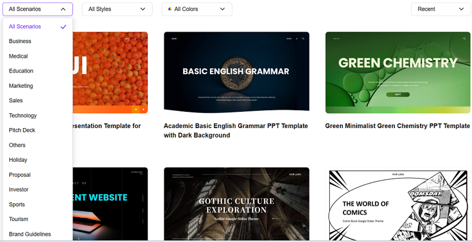
The collection of professional powerpoint templates covers the use cases that come up repeatedly in actual work: business proposals, strategy presentations, quarterly business reviews, investor pitch decks, executive briefings, product roadmaps. Not generic “professional” themes that technically work for any of these — actual category-specific layouts built around how content in each format needs to be structured.
Concrete example: I rebuilt a 28-slide competitive analysis using one of the business strategy templates. The original had been assembled manually in PowerPoint and had what I’ll generously call “inconsistent visual logic” — different fonts on different slides, text boxes that had clearly been nudged by hand rather than aligned to a grid, a chart on slide 19 that was a different aspect ratio than the chart on slide 11. The rebuild using the AiPPT template took about 35 minutes and looked like something a design team had produced. The Slide Master was clean, every layout was pre-built, and the color system applied automatically across the deck.
The free tier exports clean .pptx without watermarks, which sounds like a minor thing until you’ve downloaded three “free” templates that embed the platform’s logo in the bottom corner of every slide. For client work, that’s unusable. For anything going to leadership, same problem.
There’s also an AI generation layer if you’re building from scratch: pick a template, describe your topic and audience, and get a structured draft using that template’s layouts. I use this when I know roughly what I need to say but haven’t organized it yet — it turns a messy outline into a working slide structure in a few minutes, then I edit from there. Not every output needs significant editing. Some need a lot. But starting at 70% done is faster than starting at zero.
Slidesgo — Solid Library for Education and Academic Work
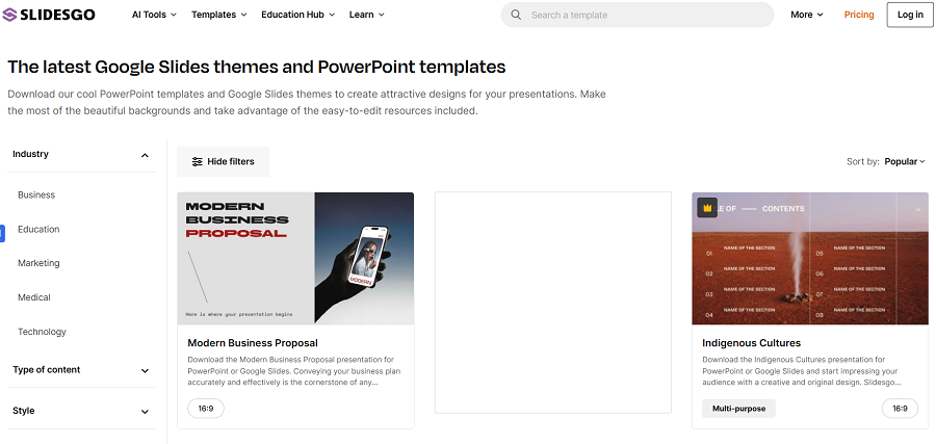
If you’re building classroom presentations, academic research decks, or curriculum materials, Slidesgo has the deepest subject-specific library I’ve found. Templates are tagged by subject and grade level, not just aesthetic style, which is actually useful — a molecular biology template and a creative writing template have different structural needs, and Slidesgo acknowledges that.
Free account required. Some premium-tier templates are the best-looking options, but the free selection is genuinely usable for most purposes. Download in .pptx or Google Slides format before starting — converting between the two afterward sometimes introduces formatting issues.
SlidesCarnival — Fast, Free, No Account
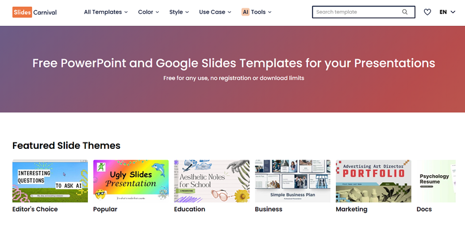
Zero-friction option. Browse, click, download, open in PowerPoint. No email, no sign-up, no free trial that converts to a subscription.
Designs trend toward clean minimalism — neutral palettes, restrained typography, layouts that work for professional content without leaning too corporate or too academic. Good fit for freelancers, independent consultants, and anyone building outside a company’s brand system who just needs something that looks considered without requiring design work to get there.
Canva — When the Design IS the Point
There are presentations where the visual execution matters as much as the content — product launch decks, brand presentations, anything that’s going to external marketing audiences. For those, Canva’s editor gives you more flexibility than anything else on this list. Largest template library, most mature design tools, deepest image and asset integration.
The honest caveat: Canva is a design environment, not a presentation generator. The AI content tools are limited compared to AiPPT. You’re providing the structure and writing the content yourself, using Canva to execute the visual layer. For the right use case, that’s exactly what you want. For a typical business deck where the argument matters more than the art direction, the extra design time usually isn’t worth it.
The Three Checks Before You Commit to a Template
I run these on every template before putting real content in it:
The grayscale test. Set your screen to grayscale (Windows: Settings > Accessibility > Color Filters; Mac: System Settings > Accessibility > Display). If the text is still clearly readable and the hierarchy still makes sense, the template will hold up in projection environments. If it turns to a gray blur, find something else.
The Slide Master check. In PowerPoint: View > Slide Master. Look at how the template is built. Is the font hierarchy set at the master level, or is it hardcoded on individual slides? Are image placeholders actually linked to the layout, or are they loose objects? Templates built properly at the master level are fast to customize. Templates where the “design” is just a pile of manually placed objects on the slide layer are slow and fragile.
The full-content test. Don’t judge a template by how it looks with placeholder text. Put your actual content — the longest paragraph, the chart with the most data, the slide with the most bullet points — into the template before committing. A template that looks elegant when empty and breaks at 80% content load is not a professional template. It’s a stock photo.
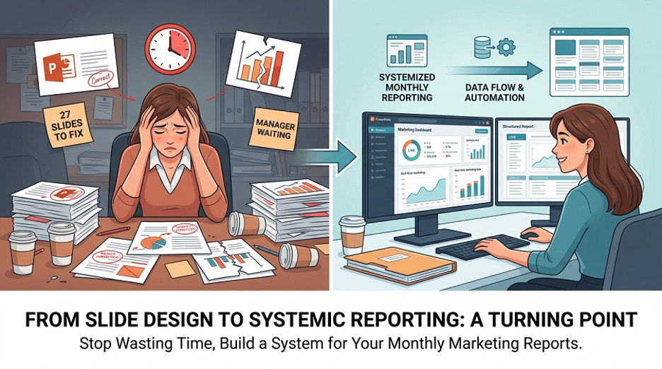
The Forty-Two Slides Situation, Revisited
I rebuilt that proposal deck about a year after the fact, out of curiosity more than anything. Same research, same analysis, same financial modeling. Different template — clean, structured, one of the business proposal layouts from AiPPT’s library. The rebuild took about two hours for a 42-slide deck.
I showed it to someone who’d seen the original. Their reaction: “This looks like a completely different company.”
Same content. Different starting point. That’s the whole argument. If you’re spending more time fighting your slides than writing your argument, you’re solving the wrong problem — and a well-chosen template from a solid powerpoint templates free download library is the fastest way to stop doing that.