
Choosing Fonts for Animated Videos: Captions, Titles and Thumbnails That Read on a Phone
By Kevin Yi
Typography in video gets less attention than typography in print, and it shows. Captions in a thin script font that vanish against a bright sky. A title card in a font that fights the art style. A thumbnail whose four words can’t be read at the size people actually see it.
Animated and AI-generated videos make this more noticeable, not less. The pictures are often bold and colorful, and the text has to hold its own against them. Here is how to choose fonts for the three places text appears in an animated video, plus the licensing question most creators never ask.
Key takeaways
- Captions are functional: a sans-serif with a large x-height, medium or bold weight, and an outline or shadow.
- Keep caption lines short: the BBC’s subtitle guidelines cap broadcast lines at 37 characters and suggest about 25 characters for vertical 9:16 video.
- Match title fonts to the animation’s art style, and use no more than two typefaces per video.
- Never let an AI image model draw your words; add all text as real type.
- Check that every font’s licence covers video and commercial use.
Video type is not print type
Three things change when text moves to video:
- It’s seen small. Most viewing is on phones, often at arm’s length. A caption that looks generous on your editing monitor is about the height of a grain of rice on a phone.
- It’s seen briefly. A caption may be on screen for two seconds. There’s no rereading.
- It sits on moving, changing backgrounds. The same caption appears over a dark forest, then a white snowfield, then a busy market.
So the rules shift toward legibility over personality, at least for anything people have to read.
Captions: legibility first
Captions are functional text. Many people watch with the sound off, and captions are also how deaf and hard-of-hearing viewers follow your story. They are expected, too: a 2019 Verizon Media and Publicis Media study, summarised by 3Play Media, found that more than half of respondents expect captions on instructional and tips content, and the same summary notes earlier research showing that 80% of people who use captions are not deaf or hard of hearing. Choose for reading, not for mood.
What works:
- Sans-serif with a large x-height. Fonts whose lowercase letters are tall relative to capitals stay readable at small sizes. Many popular open-licence sans-serifs are designed with screens in mind.
- Medium to bold weight. Light and thin weights break up on compressed video.
- Open letter shapes. Make sure a, e and s stay distinct, and that I, l and 1 can be told apart.
- An outline, shadow or background box. This matters more than the font itself. A white caption with a dark outline or soft shadow survives every background the scene throws at it.
What doesn’t:
- Script, handwriting and decorative display fonts for full sentences.
- All caps for long captions; it slows reading.
- Long lines. The BBC Subtitle Guidelines limit broadcast subtitles to 37 characters per line and give about 25 characters as the equivalent for a vertical 9:16 video. Two short lines beat one long one.
- Fast captions. The same guidelines recommend a subtitle speed of 160–180 words per minute, about 0.33 to 0.375 seconds per word.
Placement: in vertical 9:16 video, keep captions out of the bottom and right edges, where TikTok, Reels and Shorts put their buttons and descriptions. Somewhere around the lower third, but above the interface, is usually safe.
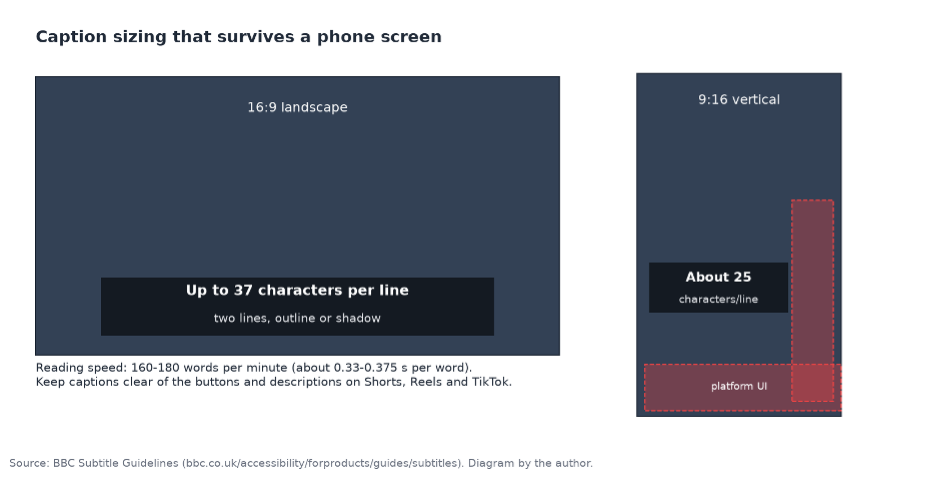
Line lengths and reading speed from the BBC Subtitle Guidelines. Diagram by the author.
Title cards: match the art style
Title cards and chapter titles are where a font can express personality, because they’re short and stay on screen longer. The trick is matching the font to the look of the animation:
| Art style | Title font direction |
| Watercolor, children’s book illustration | Rounded or humanist fonts, soft serifs, gentle handwriting |
| Comic and cartoon | Bold, slightly irregular comic-style display fonts (titles only) |
| Anime | Clean geometric sans or a bold condensed display face |
| Pixel art | Pixel fonts for titles; switch to a clean sans for captions |
| Realistic film looks | Classic serifs or restrained, widely spaced sans-serifs |
| Flat vector and whiteboard explainers | Friendly geometric sans in two weights |
Keep it to two typefaces per video: one for titles, one for captions. A third almost always looks accidental.
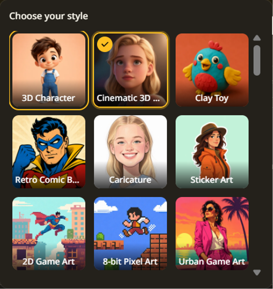
Pick the art style first, then the title font that belongs with it: a comic look, a pixel look and a 3D look each call for different type.
Keep text out of the AI pictures
Here’s a lesson specific to AI-made video: don’t ask the image model to draw your words. AI pictures often garble lettering, giving you a sign that reads almost right or a book cover in invented letters. Describe scenes without readable text, and add all titles, labels and captions as real type afterwards. You get correct spelling, your chosen font and the ability to change a word without regenerating a scene.
This is also how story video tools are designed. In ToonBee AI, for example, the scenes are drawn without on-picture titles, and captions are added on top of the finished video, in a style you choose, from the narration script itself, so the words always match what the narrator says.
Thumbnails: weight and contrast win
A thumbnail is seen at roughly the size of a postage stamp. Text on it has one job: be read in a fraction of a second.
- Three or four words, maximum.
- Heavy weights: black, extra-bold or condensed bold.
- High contrast: light text with a dark outline, or dark text on a light shape.
- Test it small. Shrink the thumbnail to the size it appears in a phone feed. If you can’t read it, increase the weight or cut a word.
The thumbnail font doesn’t have to match the caption font, but it should belong to the same family of feeling as your title cards, so your channel looks like a series.
Your workflow, in practice
A practical split for animated and AI-made videos:
- Generate the video with captions if you’re happy with the tool’s caption styles. This is the fastest route and keeps captions in sync with the narration automatically.
- Or export without captions if you need your exact brand font, and add captions in your editor from the script or an exported subtitle file.
- Add title cards and end screens in your editor, in your chosen title font.
- Build the thumbnail from a scene picture plus your heavy thumbnail font.
If you produce in the browser, say in ToonBee (new accounts start with 100 free credits, enough to test caption styles) or a similar tool, keep a small style sheet next to your projects: caption on or off, title font, thumbnail font, outline settings. Consistency across episodes matters more than any single choice.
The licensing question
A font licence that covers your desktop use doesn’t automatically cover video. Many commercial font licences separate desktop, web, app and broadcast or video use, and some charge extra for video seen by large audiences or used in paid advertising. Before you put a font in a monetised YouTube video or a client ad:
- Read the EULA for “video”, “broadcast”, “motion picture” or “commercial” wording.
- Open-licence fonts under the SIL Open Font License can be used in videos: the OFL FAQ lists video titling among the uses that need no additional licence or permission. Read the licence anyway, especially before modifying or redistributing a font.
- Free for personal use means exactly that. A monetised channel or a client project is not personal use.
- Keep a record of where each font came from and its licence, in the project folder. It saves a lot of worry if a question ever comes up.
FAQ
What is the best font type for video captions?
A sans-serif with a large x-height and open letter shapes, in a medium or bold weight, with an outline, shadow or background box so it reads over any scene.
How many characters should a caption line have?
The BBC Subtitle Guidelines limit broadcast subtitles to 37 characters per line and suggest about 25 characters for vertical 9:16 video. Use two lines at most.
Can I use free fonts in a monetised YouTube video?
Fonts under the SIL Open Font License can be used for video titling without extra permission. “Free for personal use” fonts can’t be used in monetised or client videos without a commercial licence.
Should I let AI draw the text in my video?
No. AI images often misspell or invent lettering. Keep words out of the pictures and add titles and captions as real type afterwards.
Quick checklist
- Captions: sans-serif, medium or bold, large x-height, outline or shadow, two short lines (37 characters for 16:9, about 25 for 9:16).
- 9:16 captions placed clear of platform buttons.
- Title font matched to the art style; two typefaces in total.
- No words drawn by the AI; all text added as real type.
- Thumbnail text readable at phone-feed size.
- Every font licensed for video and commercial use.
Good video typography is nearly invisible: viewers read the words and never think about the font. That’s the goal.
Kevin Yi builds AI video tools, including ToonBee AI.