From Fonts to Photography: A Smarter Creative Workflow with Free Photo Editor AI
Ask a designer where a project goes wrong and you’ll rarely hear “the idea was bad.” You’ll hear about the headline that vanished into a busy background, the photo that clashed with the typeface, or the three versions that each needed a different crop. Most creative friction lives in the seams between disciplines, where type meets image and the work has to hold together across formats.
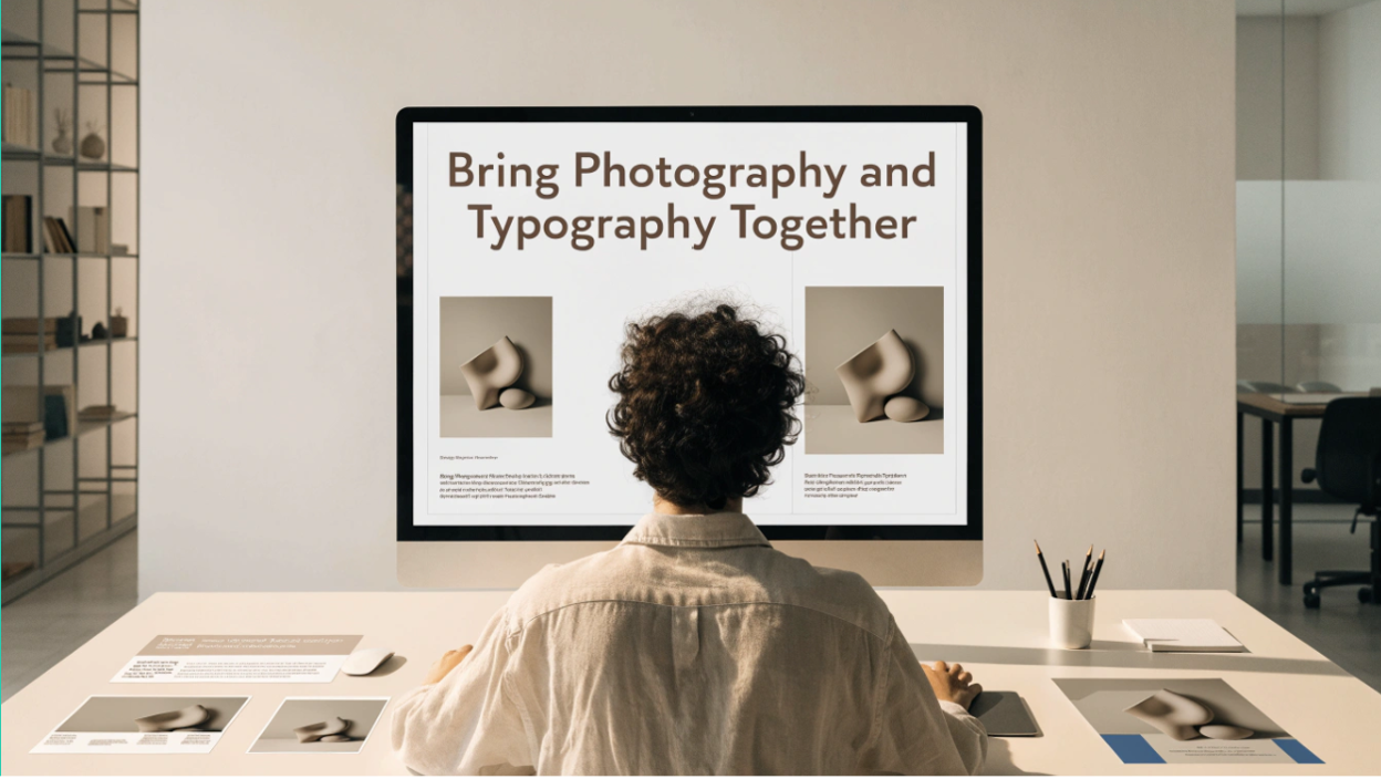
A smarter workflow starts by treating fonts and photography as one system, not two separate jobs. Here is how to build that system, and where AI photo editing fits into it.
Start with the pairing, not the pieces
Type and photography do the same job: they set tone before anyone reads a word. A tightly spaced geometric sans over a crisp, cool-toned product shot says “modern and precise.” A warm serif over a soft, golden-hour image says “human and unhurried.” Problems begin when the two say different things.
Before opening any tool, answer three questions:
- What mood should this piece carry? Pick two or three words, such as calm, bold or playful.
- Where will the text live? Decide whether the headline sits over the image, beside it or on a separate panel.
- How many places will this appear? A blog header, a social square and a vertical story each need their own composition.
Those answers drive both your font choices and your Free Photo Editor AI edits, so decide them together.
Where photos usually fight the type
Even strong photographs can work against text. The usual culprits are:
- Busy backgrounds behind the area where words will sit
- Uneven lighting that makes parts of the image too bright or too dark for readable text
- Cropping that leaves no breathing room for a headline
- Color casts that clash with your brand palette
- Distracting objects pulling the eye away from the message
None of these are font problems, but all of them make fonts look wrong. Fixing the image first often solves what looks like a typography issue.
Where AI photo editing earns its place
Prompt-based editors let you describe a change and apply it to an existing photo, without masks or layers. According to its site, Free Photo Editor AI lets you upload an image, describe the edit in text, and download the result without a watermark. It also lists the following:
- Background replacement and object removal through prompts
- Lighting and color adjustments
- Reference-image guidance for matching colors, materials or mood
- A stated aim of preserving faces, details and composition during edits
- Aspect ratio selection before generating
- No sign-up, with five free credits per day that refresh the next day
- JPG, PNG and WEBP uploads up to 24MB, plus a separate batch editor page
Used in service of layout, those features translate into practical moves:
- Create calm zones for text. Ask for a simplified, softly blurred or evenly toned area where the headline will go.
- Balance the light. Even out a harsh gradient so white or black type stays readable across the whole line.
- Match the palette. Nudge colors toward your brand tones so the photo and the typography belong together.
- Remove the distractions. Take out the stray object that competes with your focal point.
- Generate each format deliberately. Pick the ratio before you create, so you aren’t cropping the subject out of the frame afterward.
One rule: keep the words out of the AI
AI image tools are good at pictures and unreliable with lettering. Generated or edited text can warp, misspell or quietly change. So the clean division of labor is:
- The AI edits the photograph. Background, light, color, clutter.
- You set the type. Use your layout software, with real fonts, real kerning and exact copy.
This also protects your brand. Logos, prices, dates and legal lines should never pass through a generative step.
A workflow you can repeat
1. Define the system. Write a short style note: your typefaces, two or three brand colors and the photographic mood, such as soft natural light, clean backgrounds or high contrast.
2. Pick source photos with text in mind. Choose images with natural empty space and a clear subject. Sharp, well-lit sources work best, and low-resolution or noisy photos tend to give weaker results.
3. Edit for the layout. Write prompts that serve the composition. For example:
- “Keep the subject and its colors exactly as they are. Simplify the background on the left into a soft, even, light-gray tone, with gentle natural lighting.”
- “Remove the cable in the lower right. Do not change anything else.”
- “Warm the overall tones slightly toward cream and terracotta, keeping the product unchanged.”
4. Use a reference when words fall short. If you have a finished piece that captures the look you want, upload it as a reference image and ask the editor to guide the new photo toward it.
5. Generate by channel. Create the wide, square and vertical versions separately, so each composition keeps its focal point and its empty space.
6. Set the type last. Bring the edited images into your design tool, add headlines and body copy, then check contrast and legibility at the sizes people will actually see.
7. Review as a set. Lay the final pieces side by side. If one looks like it belongs to a different brand, adjust the prompt stem or the reference image and rerun it.
Habits that keep the system consistent
- Keep a prompt stem. A reusable sentence describing your light, background and mood prevents drift from one project to the next.
- Keep a reference folder. Three to five approved images are worth more than a long description.
- Name files clearly. Include project, channel and version so you can find the right one later.
- Archive originals. Untouched photos let you start over without degrading quality.
- Protect the subject. Add a line such as “keep the product’s shape, color and label unchanged,” and always compare the output with the real thing.
Using the free tier wisely
Five credits a day suits a small project or a handful of hero images per week. Plan your prompts before generating, spend credits on the images that will appear most widely, and spread larger jobs over several days. If your volume is higher, the pricing page is worth a look, and it’s wise to confirm current features and limits before building a routine around them.
A few cautions
- Check that you own or have permission to use any photo you upload, and read the tool’s privacy policy and terms before uploading client or sensitive material.
- Don’t upload images of other people without their consent.
- If your work involves advertising or product claims, make sure edited images still represent the real item honestly, and check platform rules on altered photos.
The payoff
A smarter creative workflow isn’t about more tools. It’s about fewer surprises. When fonts and photographs are planned together, photos are edited to leave room for the words, and every format is generated on purpose, the work comes together faster and looks like it was made by one hand.
AI photo editing handles the tedious middle of that process, the cleanup, balancing and reformatting, so your time goes to the decisions that need a person: what to say, how to say it, and how it should feel.