How Designers Can Use Free Image to Image AI to Explore Color Palettes, Textures, and Art Direction
Every design project has a moment before the real work starts, when a designer is still circling the idea, trying different directions, not yet committed to one. That exploratory stage is where the best decisions usually get made, but it is also the stage that gets squeezed first when deadlines tighten. Producing five genuine visual directions by hand takes real time, so most projects end up testing two or three instead of the ten that might have actually revealed something better.
Free Image to Image AI changes the economics of that exploratory stage. By taking a reference image and transforming it through a prompt, a designer can generate several distinct variations in the time it used to take to produce one. This article looks at how that actually works for color exploration, texture experimentation, and broader art direction, and where a designer’s judgment still matters most.
Exploration Has Always Been the First Casualty of a Deadline
Design education teaches iteration as a core part of the process. Try many directions, narrow them down, refine the strongest one. In practice, that ideal gets compressed under real world time pressure. A designer facing a tight deadline often skips straight to developing one or two concepts fully, because exploring widely feels like a luxury the schedule does not allow.
The cost of that compression is invisible but real. A concept that gets selected without genuine comparison is a concept chosen partly by default, not necessarily because it was the strongest option. Widening the exploration phase, even slightly, tends to produce noticeably stronger final work, simply because more real alternatives were actually considered before anything got locked in.
An image to image tool directly targets this bottleneck. Because generating a variation takes a prompt rather than hours of manual work, the cost of trying one more direction drops close to nothing. That changes what is realistic to explore within a normal project timeline, not by replacing the designer’s eye, but by giving that eye more raw material to react to.
Color Palette Exploration
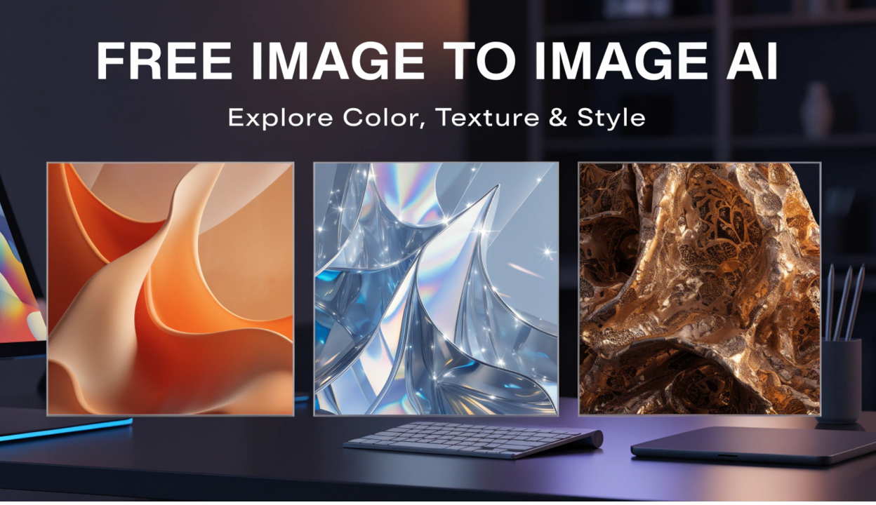
Color decisions are often made too early in a project, partly because testing a genuinely different palette by hand means redoing significant work. An image to image tool removes that cost. Starting from a finished or near finished composition, a designer can generate several palette variations quickly, a warmer version, a cooler version, a high contrast version, a muted version, and actually see how each one changes the feel of the piece before committing.
This matters because color decisions are highly contextual. A palette that feels confident on screen can feel flat in print. A palette that works for one brand audience can feel wrong for another. Seeing several real variations side by side, rather than imagining how a different palette might look, leads to a more informed decision, and often surfaces an option the designer would not have arrived at by adjusting sliders on the original.
Texture and Material Exploration
Texture is one of the hardest qualities to iterate on quickly by hand, because it often involves rebuilding significant parts of an image rather than making a simple adjustment. A smooth, polished surface and a rough, tactile one can completely change how a design feels, even when the underlying composition stays identical.
Using a reference image and prompting for different textural treatments, a matte finish versus a glossy one, a hand drawn texture versus a clean digital one, gives a designer a fast way to compare these qualities directly. This is particularly useful in product design and packaging work, where the physical feel a design implies matters as much as its layout. Testing several textural directions early, before any of them get locked into production specifications, catches mismatches between intended feel and actual execution while they are still cheap to fix.
Art Direction and Overall Mood
Beyond individual elements like color and texture, image to image tools are useful for testing broader art direction, the overall mood, tone, and stylistic language a project should use. A single reference image can be reinterpreted in several different art directions, more minimal, more maximalist, more illustrative, more photographic, giving a team something concrete to react to rather than debating style in the abstract.
This is especially valuable in early client or stakeholder conversations. Showing a handful of real visual directions, even rough ones, tends to produce much clearer feedback than describing directions in words or showing reference images from completely unrelated projects. People are generally better at reacting to something concrete than imagining something from a description, and a quick set of generated variations gives them exactly that.
A Practical Way to Use This Without Losing Control
A few habits keep this kind of exploration useful rather than overwhelming.
Start with a clear reference, not a vague one. The quality of what comes out depends heavily on the quality and specificity of what goes in. A clean, well composed reference image gives the tool something solid to build from, while a rough or ambiguous one tends to produce equally ambiguous results.
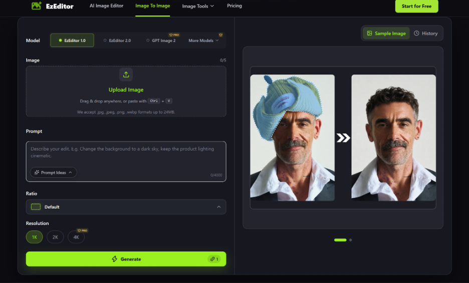
Generate in batches, then narrow deliberately. Producing several variations at once and comparing them side by side is far more useful than generating one, judging it in isolation, then generating another. Real comparison requires options sitting next to each other.
Treat every output as a draft, not a deliverable. Generated variations are excellent for deciding direction, but final production work, exact brand colors, precise typography, print ready specifications, still needs a deliberate, careful pass by the designer. The tool accelerates exploration, not final execution.
Keep the original creative decision with the designer. The tool widens the range of options a designer can see quickly. It does not replace the judgment required to know which option actually serves the project. The fastest way to get weak results from this kind of exploration is to accept the first generated variation that looks decent, rather than using the speed gained to genuinely compare several real options.
Where This Fits in a Real Project Timeline
The honest value here is time reallocation, not time elimination. A designer still needs to think carefully about color theory, material feel, and art direction. What changes is how much of that thinking happens against real, visible options instead of imagined ones. A project that used to spend most of its early phase producing just enough material to make a decision can instead spend that same time actually comparing meaningfully different directions, then invest the time saved into refining the strongest one properly.
Final Thoughts
Good design decisions tend to come from genuine comparison, not from committing early and hoping the first instinct was right. Free Image to Image AI lowers the cost of that comparison enough to make real exploration practical even under a tight deadline, across color, texture, and overall art direction alike. The judgment still belongs to the designer. What changes is how much real material that judgment gets to work with before a decision has to be made.