How to Pair Fonts with AI-Generated Backgrounds
A beautiful background can make a poster harder to read. Leaves cross the headline, a bright reflection cuts through the date, or a delicate font disappears into a paper texture. Pairing fonts with AI-generated backgrounds starts with a practical question: where will the words live? Choosing the type and the image together gives both a clearer role.
Whisk AI can fit into the image exploration stage of that process. It is a web-based image-generation and editing service, with text and reference-image workflows for developing visual directions. A designer can use it to explore background ideas, then place the final wording in a layout editor where spelling, font choice, and spacing remain editable.
That division is useful even when a generator can render convincing lettering. Keep information that must remain exact, such as dates and prices, in a separate text layer. An image can establish the mood; typography needs to deliver the message.
Match Font Pairings to the Background’s Job
Start by deciding what the image should contribute: atmosphere, a recognizable subject, or supporting texture. If the background already carries a strong visual identity, the supporting type can be restrained. If the image is quiet, the headline has more room for personality.
A serif headline and a simple sans serif for details make a useful starting point for an exhibition or editorial-style poster. A heavy sans serif headline can suit a geometric composition. A script face may work for a short accent, but using it for the time, address, and booking instructions makes the reader do unnecessary work.
These are starting points, not fixed rules about which font categories belong together. Two fonts need different jobs more than they need different labels. A single family with contrasting weights can provide enough hierarchy. Conversely, two unrelated families can compete if both have decorative shapes and similar visual weight.
When browsing fonts, preview the actual wording. A typeface that looks attractive in an alphabet specimen may have awkward spacing in your event name. Check the ampersand, numerals, punctuation, and any accented characters the finished design requires. Judge the pair at the intended size, not only in a large preview.
A Font-First Workflow for AI Backgrounds
The following process keeps image exploration connected to the actual layout, so the background supports the copy from the beginning.
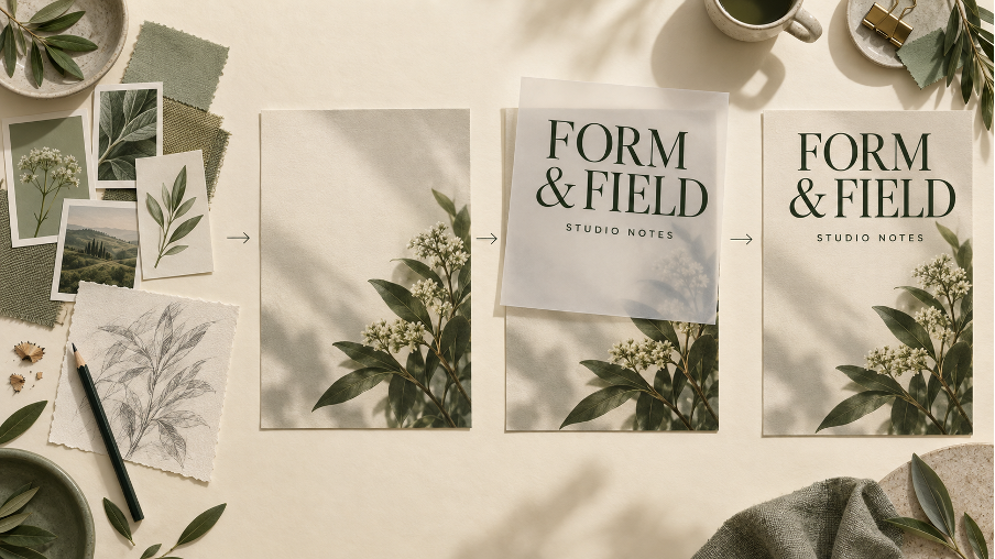
Concept illustration: references, background, editable typography, and assembled layout are separate stages.
Step 1: Set the Copy and Reading Order
Write the headline, supporting line, and essential details before generating an image. Decide what a viewer should notice first, second, and third. Set up a plain artboard with the real copy and a rough type hierarchy.
For a workshop poster, the event name might come first, the subject second, and the date and venue third. If everything looks equally important, adjust size, weight, or spacing before adding decoration. This plain version becomes the reference for judging every background option.
Step 2: Describe the Space Around the Text
Prepare a small set of references you are entitled to use: perhaps a material texture, a lighting example, and a composition sketch. Give each a clear purpose. A crowded mood board can introduce several competing directions without explaining where the text needs to go.
Describe the background in terms of placement as well as style. For example: “Warm cream paper texture, soft botanical forms concentrated along the lower-right edge, broad uncluttered upper-left area, gentle lighting, no lettering or logos.” Treat this as a starting brief, not a guarantee of exact placement.
Review a few variations with the rough text layout on top. Reject images that put sharp edges, bright highlights, or important subjects behind the copy. Revise one variable at a time, such as subject position or texture intensity, so the reason for an improvement remains clear.
Step 3: Add Real Typography on Separate Layers
Bring the chosen background into a layout editor and insert the actual font files through that editor’s normal type controls. Set the headline and details as editable text. Do not ask an image edit to repair one date if replacing that date in a text layer will preserve the rest of the design.
Look closely at spacing between letters, line breaks, and the distance between information groups. If a long title becomes cramped, try a different line break before shrinking every element. If the background still competes, move it or introduce an opaque text panel rather than repeatedly changing fonts.
Step 4: Review the Delivered Size
Export a preview and view it at approximately the size people will encounter it. A full-screen design can hide small-text problems that become obvious in a feed. For print, inspect a proof at the intended physical size and viewing distance.
Read the smallest essential line first. Then check the title and the overall sequence. If the date is difficult to read, improve its size, weight, position, or background. Repeat the check after every crop: moving the image can change the contrast beneath the same words.
A Worked Example: One Poster, Three Checks
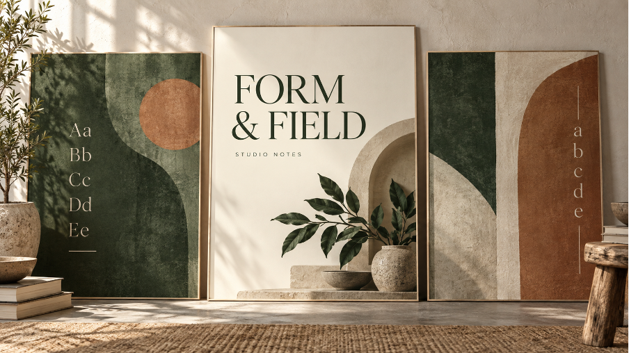
Consider a fictional studio event called “Form & Field.” This is a design exercise, not a reported client campaign. The brief is a calm botanical identity with a distinctive headline and practical event details.
Begin with a 1080 × 1350-pixel artboard, an 80-pixel outer margin, a 72-pixel serif headline, and 42-pixel sans serif details. These are trial settings, not universal specifications. At a displayed width of 360 pixels, the image scales to one-third size: the headline has an effective font size of about 24 pixels and the details about 14 pixels. That calculation exposes why checking only the large working file is misleading.
Use three checks before selecting the final background:
- Copy check: Can the longest line fit without reducing the essential details? Revise the line break or layout if it cannot.
- Background check: Do leaves, shadows, or texture cross the text? Move the imagery or add a solid panel where necessary.
- Crop check: Does the hierarchy still work in the square version? Recompose the design if a simple crop removes the text area.
For a reproducible color check, solid dark pine text in #172B2B over a solid cream panel in #F4F0E8 has a calculated WCAG contrast ratio of approximately 13.0:1. That figure applies to those two flat colors. It does not describe every pixel in a generated illustration, and it does not guarantee that tiny lettering will be readable.
WCAG’s minimum contrast criterion uses 4.5:1 for ordinary text and 3:1 for qualifying large text, with defined exceptions. For a digital graphic, checking against these values is useful, but the rendered size and the actual background behind the letters still matter. A bright patch elsewhere in the image says nothing about the area underneath a dark word.
Background Exploration vs Finished Layout: Key Differences
The table compares three approaches by their starting material, revision control, useful applications, and the limitations a designer still needs to manage.
| Criteria | Whisk AI background exploration | Stock-image layout | Manual illustration and typesetting |
| Starting Point | Text briefs or image references | An existing licensed photograph | A sketch and design brief |
| Font Control | Separate editor handles final type | Separate editor handles final type | Direct control in layout software |
| Revisions | Generate or edit image directions | Crop or replace the photograph | Redraw and adjust individual elements |
| Visual Flexibility | Explore several background treatments | Limited by available source images | Tailor each element to layout |
| Best Use Case | Early concept and mood exploration | Working with a suitable existing image | Precise commissioned visual systems |
| Main Limitation | Outputs need careful visual review | Composition may restrict text placement | Requires drawing and production time |
A generated background and a carefully chosen font solve different parts of the job. Keeping them separate makes a date change possible without rebuilding the artwork.
Adapt the Design to Posters, Social Posts, and Web Headers
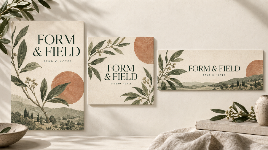
Concept illustration: shared colors and type roles connect layouts that use different compositions.
For event posters, give the event name a strong identity and keep the venue and time straightforward. The image can create atmosphere, but practical information needs its own uninterrupted space. Proof the smallest type before approving a print run.
For social posts, keep the font roles consistent across a series while changing the imagery. A square post and a portrait post may need different subject positions. Repeating the same hierarchy helps the series feel related without forcing every image into an unsuitable crop.
For website headers, use live HTML text when practical instead of baking the headline into the image. It can then reflow with the page and remain available to assistive technology. Test the narrow layout as well as the desktop banner; the text may need to sit above the image on a phone.
Finish with a Production Check
Before delivery, check every name, date, numeral, and line break against the approved copy. Confirm that the font license covers the intended use; a downloadable font is not automatically cleared for every commercial or embedding context. Review the permissions for reference images and the image service’s applicable terms as well.
Keep the layered working file alongside the final exports. Record the selected font families, weights, colors, and background version so another designer can make changes without guessing. Image resolution, print color handling, and export settings still need to match the destination.
This workflow suits small studios, event organizers, and content designers developing a visual direction. It provides room to explore imagery while leaving precise communication under direct control. The final test is practical: the design should express a mood, and the reader should still be able to find the information.