Style References Break Seedance 3.0 Letterform Motion
Type specimens look honest as stills. Once the same letters start moving, thin strokes thicken, counters close, and a clean geometric face starts to look hand-smoothed. That failure is expensive for foundries and UI teams because the clip is supposed to prove the font, not invent a softer cousin. Tools marketed around Seedance 3.0 make that risk visible fast when a style board is treated like a free-for-all mood pack.
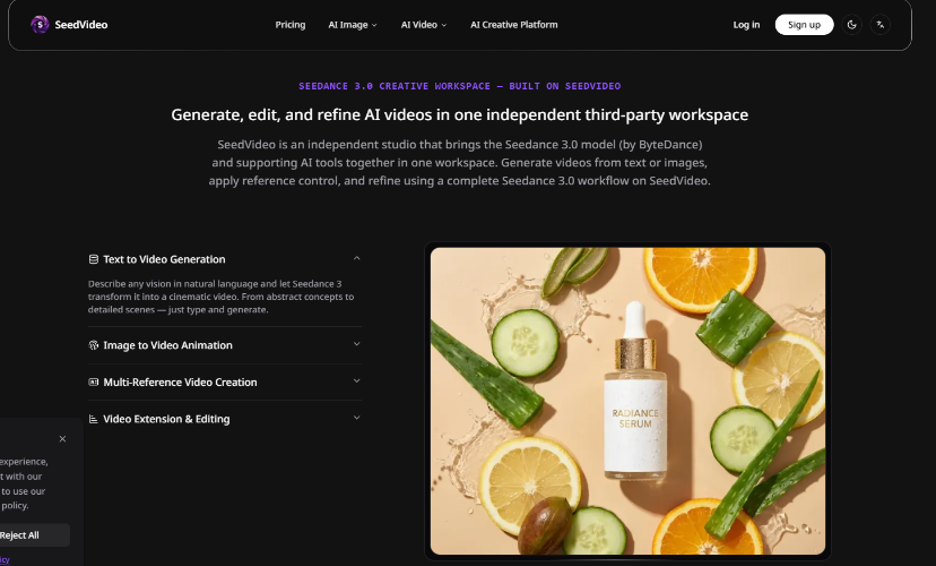
SeedVideo is useful here as a short-draft studio, not as a replacement for a type lab. The practical test is narrow: can a five-second motion sample keep the glyph edges you already approved, while only one uploaded image is allowed to talk about look and feel? If that single style job holds, you earned a longer pass. If it does not, more adjectives will not save the curve.
Why Specimen Loops Fail Before Anyone Blames The Model
Most specimen loops fail in the brief, not in the render queue. A designer uploads a specimen poster, a brand gradient, a textured paper scan, and a fashion still, then asks for “premium kinetic type.” Each file pulls the model in a different direction. The letters absorb paper grain, fashion contrast, and poster crops at once. Viewers blame “AI video.” What actually broke is role collision.
Font work has a harsher pass rule than lifestyle B-roll. A running shoe can tolerate a little plastic stretch. An /a/ or /g/ cannot. If the bowl of the /a/ fattens, or the crossbar of the /t/ drifts off its optical center, the clip is unusable for a release page or a retailer kit. Treat that as a hard fail before you discuss cinematic camera moves.
Give Style One Job And Nothing Else
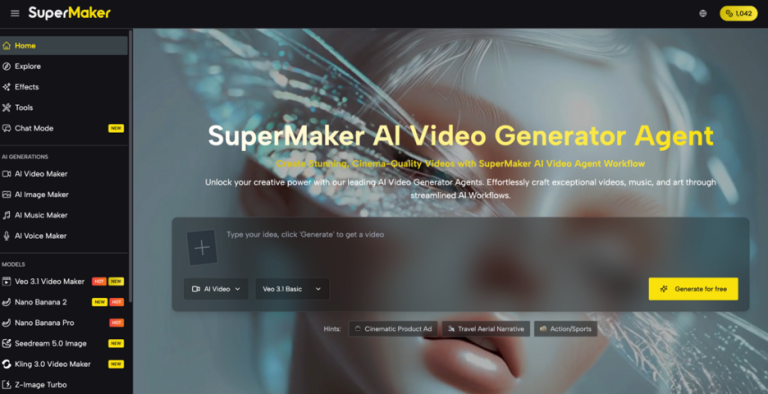
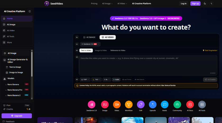
On SeedVideo, generation sits under AI VIDEO with Seedance 2 available today while Seedance 3.0 planning content sits beside the studio. Modes include Text to Video, Image to Video, and Reference to Video. For letterform motion, Reference to Video or Image to Video is the safer entry, because the source glyph already exists.
The guide language around a Seedance 3.0 AI Video Generator workflow is blunt about references: give each image one job—identity, product shape, scene, style, first frame, or continuity. For type specimens, map that list ruthlessly.
- Style reference: color grade, film look, or brand aesthetic only
- Product-shape thinking: treat the letter as the object that must not warp
- Scene reference: optional later, never on pass one
- Identity reference: skip unless a mascot face shares the frame
One strong style board is usually easier to control than several images with competing jobs. If the specimen PNG already carries the letterforms, do not also upload a second “pretty type” collage. That second file will fight the edges you meant to protect.
Three-Step Workflow Before Raising Resolution
The public create panel defaults that show up beside a short clip—720P Resolution, 16:9 Ratio, 5s, and a visible credit preview such as 30 Credits—are a useful discipline for specimen work. Start there. Do not open with a long vertical reel when you still do not know whether the /s/ terminals hold. Designers usually wasted an afternoon here polishing lighting before the word is honest.
Step 1 Crop One Clean Glyph Sheet
Export a flat specimen with high contrast, no mock UI chrome, and no tiny legal lines fighting the main word. Crop so the wordmark or sample string fills most of the frame. Competing backgrounds invite the model to invent texture inside the counters.
Step 2 Name The Style Role In The Prompt
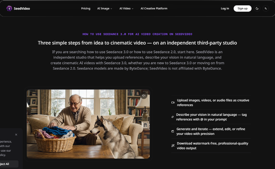
Write the prompt like a production note, not a mood essay. Say what the reference controls. Example shape: keep the uploaded letters as the product shape; let the style reference only set lighting mood; slow push-in; no new characters; no extra logos; 5 seconds; 16:9. Put subject, action, and camera early. Leave poetry for later.
Step 3 Generate Once, Then Change One Variable
Generate the draft on SeedVideo, then review it like footage: first two seconds of readability, stroke weight, counter shapes, and whether the camera path is doing too much. If the letters soften, shorten the motion or remove the style board before you raise resolution. Fix one thing at a time—prompt conflict, reference role, aspect ratio, or duration—so you know what actually repaired the glyph.
| Decision | First specimen pass | Change only when |
| Duration | 5 seconds | Edges survive a full loop scrub |
| Ratio | 16:9 for site or deck crops | Composition already holds |
| Reference count | One style job, or none | Each added file solves a different problem |
| Resolution climb | Keep the draft setting first | Letterforms pass the still overlay check |
The table is a brake pedal. Specimen teams burn credits when they chase 720P polish before the word is stable at five seconds.
Prompt Fields That Protect Glyph Edges
A usable brief for this job has fewer fields than a commercial storyboard:
- Subject: the exact word or glyph string already in the still
- Action: one motion only—slow parallax, gentle rotation, or a short push-in
- Camera: one path, one lens feel, no whip pans
- Reference role: style only, or product-shape preservation only
- Negative guardrails: no extra logos, no text overlays, no face morphing, no redesign of the letters
If you need paper texture, add it after the letters pass. Texture inside a counter is harder to undo than a flat background you composite later. SeedVideo will happily animate whatever you feed it; it will not know your foundry’s release checklist unless you write that checklist into the brief.
Kill The Render When Curves Soften
Use a simple overlay check. Place the original specimen still beside the video on a dark slide. Scrub the mid frame next to the original. If bowls fill in, serifs melt into the counters, or a geometric /o/ looks warped, kill the take before it enters the shared brand folder. That single discard is cheaper than a Slack thread arguing about “AI warmth.”
In my testing of this checklist on foundry release packets, the fail is almost always readable in the first two seconds: the word looks impressive as motion until you freeze a mid frame and compare stroke weight. When the letters are unreadable as type—even if the lighting looks premium—the clip cannot publish.
Common recovery order when the output drifts:
- Remove competing style adjectives from the prompt
- Keep a single reference role explicit
- Shorten duration toward the five-second default
- Reduce camera complexity before raising quality
Paid usage on the platform is positioned with watermark-free exports, which matters once a specimen is approved for a public page. Until then, the draft’s only job is edge honesty. Keep the only variable on each retry either the style board or the camera path, never both, so the next pass teaches something.
Keep The Next Specimen On The Same Brief
Save the winning prompt, the one reference file, the 5s / 16:9 pair, and a one-line fail note such as “counters closed when paper texture was added.” The next weight in the family should reuse that packet. Foundries lose afternoons when every designer improvises a new mood stack for the same release.
SeedVideo fits teams that need repeatable short motion checks beside a larger design process. It is a weak fit if you expect the model to invent a missing master from a blurry phone photo of a printed specimen. Fix the still first. Animate second. Judge the letters before you judge the lighting. If the first preview looked fine until the overlay check, trust the overlay—not the timeline thumbnail.
For multi-weight releases, rerun the same path each time: same crop, same five-second lock, same style role sentence. The goal is a specimen loop a retail partner can defend, not a mood film that invents a second alphabet.