Orchestrating a Unified Design System Without a Dedicated Illustrator
Product cycles in edtech demand relentless asset generation. Six months usually means shipping onboarding flows, student dashboards, and gamified success screens. You also need subject-specific course headers, marketing landing pages, and dozens of empty state variations. Pumping out that sheer volume of graphics traditionally requires keeping a freelance illustrator on a hefty retainer.
When hitting aggressive launch schedules becomes the top priority, waiting an entire week for a freelancer to sketch, revise, and finalize custom error states creates an unacceptable bottleneck.
Finding an alternative to that expensive, slow feedback loop becomes critical.
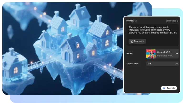
I recently spent several months integrating Ouch, a vector and 3D illustration library by Icons8, into an evolving edtech product.
The Reality of the Six-Month Product Cycle
Thursday afternoon product syncs usually go like this. Your lead developer suddenly needs twenty empty state graphics for a newly scope-creeped assignment module. Monday morning is the hard deadline. Hired freelancers generally need a detailed creative brief, mood boards, reference materials, and several days just to produce rough sketches.
That timeline doesn’t work.
Speed acts as the ultimate advantage of off-the-shelf platforms. Opening Ouch, I instantly filter through 101 available illustration styles to match our existing UI. Finding a consistent sketchy look fitting our brand takes seconds. Searching for terms like “waiting”, “no results”, or “payment failed” yields immediate SVG downloads. Designers no longer have to wait days to see visual progress. Friday morning rolls around, and those graphics are already recolored in our brand palette and pushed to the staging environment.
Cohesive design builds immense trust with new users. Leaning on disjointed clipart images pulled from different corners of the internet instantly degrades curriculum quality. Visual coherence matters most. Ouch provides styles covering the entire user experience flow. Unified representations for complex digital interactions like logins, add-to-cart actions, and 404 pages sit right there waiting.
Structuring the Platform Interface
Core interfaces need strict consistency. My workflow begins in the Pichon desktop app. Pichon packs all those Ouch illustrations alongside icons and transparent PNG photos natively into macOS or Windows.
Launching our main UI file happens next. Selecting a minimal monochrome style fits our older demographic of learners perfectly. Populating the student dashboard is my first target. Grabbing a “welcome” scene for the header solves the hero section. Securing a “success” illustration for completed modules and an “error” graphic for broken video links finishes the core views.
Dragging raw vectors straight from the app into the layout speeds everything up. Paid plans unlock essential SVG formats. Choosing primary stroke colors lets me globally swap them to our exact brand hex codes.
Off-the-shelf assets suddenly look entirely proprietary.
Building Custom Course Materials
Educational platforms also demand highly specific imagery for actual course content. Pre-made scenes rarely fit niche lessons about cellular biology or financial literacy.
Moving away from static scenes becomes necessary here. Layered vector graphics solve the problem. Every graphic breaks down into tagged, searchable objects.
Building a science module header starts by opening Mega Creator, a free online editor provided by Icons8. Blank canvases invite experimentation. Searching the “People” category uncovers a character in our chosen trendy style. Exploring the “Objects” category reveals microscopes and test tubes. Throwing in a few background shapes adds depth to the scene.
Arranging these separate elements creates a single, custom composition. Swapping out the character’s shirt color matches our secondary brand palette perfectly. Exporting the newly combined SVG wraps up the task.
Ten minutes is all it takes to bypass commissioning a custom illustration for a low-traffic course page.
Evaluating Alternatives for Long-Term Projects
Committing to any visual approach requires understanding trade-offs between different sourcing methods.
Freelance illustrators yield highly tailored results. Proprietary metaphors ensure competitors can’t copy your exact look. Cost and rigid timelines act as massive downsides. Six-month cycles involve constant scope changes, feature pivots, and last-minute marketing demands. Agile development suffers when freelancers bill for every minor revision and demand significant lead times. Startups can’t afford to pause sprints while waiting for an artist to redraw a character’s posture.
Free libraries like unDraw offer quick SVG downloads and simple recoloring. Severe lack of style variety ruins their appeal. Early-stage companies rely heavily on that single specific aesthetic to pad out thin products. Relying on it instantly makes a platform look generic. Users immediately recognize you took the cheapest possible route to launch.
Aggregate marketplaces like Freepik provide immense volume. Contributor models act as their fatal flaw. Thousands of different artists upload files daily. Achieving true visual consistency across an entire app becomes nearly impossible. Finding a great graphic for the login screen is easy. Matching that exact aesthetic for your remaining empty states rarely happens.
Strict style guidelines across the Ouch library solve that headache. Massive asset catalogs sit neatly categorized into distinct, matching collections.
Boundaries and Limitations of the Library
Existing libraries do come with strict boundaries. Abstract, proprietary concepts demanding custom metaphors won’t work well with Ouch. Building software for a very specific niche presents unique challenges. Industrial pipeline management or niche medical diagnostics rarely get accurate representations in standard “Technology” or “Healthcare” categories.
Commercial software development demands more than any free tier offers. Free plans restrict downloads to PNG formats while requiring visible attribution links back to Icons8. Placing those links under every illustration on a paid educational platform looks profoundly unprofessional.
Paid subscriptions are mandatory for accessing high-resolution files. They’ll also unlock SVG formats for deep recoloring and remove pesky attribution requirements entirely. Professional applications demand clean interfaces, free from third-party branding links cluttering the footer.
Strategies for Maintaining Cohesion
Scaling a visual language without an illustrator requires strict internal rules. Letting multiple designers pull assets haphazardly isn’t going to work. It’s a recipe for a disjointed platform.
- Pick exactly one primary style and one secondary style from the catalog. Document them clearly in your design system.
- Download SVG formats exclusively. Use scripts or bulk-edit tools to unify all stroke widths and fill colors to your exact brand guidelines.
- Marketing pages thrive on motion. Grab Lottie JSON or After Effects project formats of exact characters used in your app for cohesive animations.
- Construct complex scenes from individual searchable objects. Relying on popular pre-made compositions guarantees you’ll look exactly like other startups.
Modern asset libraries have matured significantly over the last few years. Treat these catalogs like raw material toolkits instead of finished galleries. Doing so lets any design team sustain massive output requirements entirely in-house.