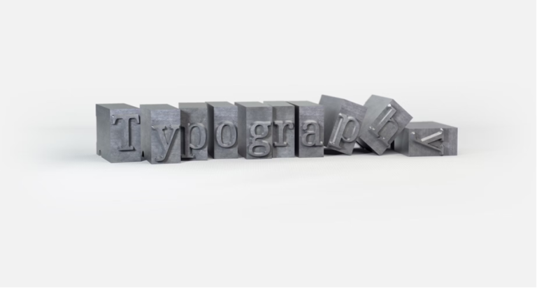
Why Typography Breaks Down in Growing Creative Teams – and How to Prevent It
Typography is often treated as a creative decision.
A designer selects a font that feels right, tests a few weights, refines spacing, and moves on. In small teams, that works well enough.
But as projects scale and more contributors become involved, something subtle begins to happen: the type system starts to drift.
A landing page introduces a new headline font. A marketing campaign experiments with an alternative display style. A product update adjusts body text sizing for readability.
None of these decisions are inherently wrong. The problem is that they are rarely connected.
Over time, the design system becomes less cohesive, and the experience feels fragmented – even if users cannot immediately articulate why.
This is not a typography problem. It is an execution problem.
In digital environments, consistency is rarely maintained by intention alone. It requires ownership, visibility, and a rhythm of review. When those elements are missing, even the strongest visual systems begin to weaken.
When Typography Becomes Decentralised
As creative teams grow, responsibilities become more distributed. Designers, marketers, developers, and content teams all interact with typography in different ways. Without a clearly defined system and a single point of accountability, decisions multiply.
- A developer may prioritise performance and swap a font for load speed.
- A marketer may download a new typeface for a seasonal campaign.
- A designer may test a stylistic update without documenting it.
Individually, these decisions make sense. Collectively, they introduce inconsistency.
Research from OKRs Tool, based on analysis of more than 200 teams, found that 65% admitted their work was not clearly tied to broader objectives. The issue was not capability – it was alignment. When ownership and shared direction were unclear, execution became fragmented.
Typography behaves the same way inside creative teams. When there is no visible owner of the type system and no agreed review cadence, drift becomes inevitable.
Typography Is Infrastructure, Not Decoration
Many teams think about fonts in terms of brand personality. While tone is important, typography also serves structural functions:
- Establishing hierarchy
- Improving readability across devices
- Supporting accessibility standards
- Maintaining visual rhythm
- Influencing perceived performance and polish
When typography is treated as infrastructure, it receives the same attention as code architecture or product workflows. It becomes documented, versioned, and reviewed – not simply chosen.
Strong creative teams define:
- Core type families and fallback options
- Usage rules for headers, subheads, and body text
- Weight and spacing guidelines
- Accessibility contrast standards
- Web performance considerations
This clarity reduces friction. Designers move faster because decisions are already structured. Developers implement more consistently because expectations are documented. Marketing campaigns remain visually coherent because the system is shared.
Ownership Prevents Design Drift
In many organisations, typography “belongs” to the entire creative department. That often means no one is directly responsible for its consistency.
Assigning ownership does not restrict creativity. It strengthens it.
An owner ensures that:
- New fonts are evaluated before adoption
- Documentation remains updated
- Deviations are intentional rather than accidental
- Performance and accessibility are considered
The earlier research insight about ownership improving execution translates directly here. When responsibility is explicit rather than implied, follow-through improves. Decisions do not disappear between meetings or project handoffs.
Typography stability is less about rigid rules and more about visible accountability.
The Importance of Review Cadence
Typography decisions are often made during redesigns and then left untouched for years. However, digital environments change constantly. New devices, browser updates, accessibility requirements, and performance standards all affect how fonts render and function.
Teams that maintain consistency revisit their design systems periodically. They conduct audits. They test load times. They gather feedback from developers and users. They refine hierarchy based on real usage.
Without that rhythm, systems stagnate or fracture.
The research on execution habits mentioned earlier highlights the power of regular review in maintaining alignment. The same principle applies to design. When typography standards are revisited on a predictable schedule, small inconsistencies are corrected before they compound.
Consistency becomes sustainable rather than accidental.
Free Fonts Require Strategic Use
Access to high-quality free fonts through platforms like FontMirror has expanded creative possibility dramatically. Designers can explore diverse typefaces without licensing barriers. This accessibility is powerful – but it also increases the likelihood of experimentation without structure.
The goal should not be to limit access. Instead, teams should establish evaluation criteria before adopting new fonts:
- Does the font scale across digital contexts?
- Does it support sufficient weights and styles?
- Is performance acceptable for web environments?
- Does it align with brand tone long-term?
When selection is strategic rather than impulsive, free fonts become assets within a controlled system instead of contributors to fragmentation.
Alignment Is a Creative Advantage
Typography consistency is not about rigidity. It is about cohesion. When product, marketing, and design operate from the same typographic framework, experiences feel intentional and polished.
Misalignment rarely announces itself loudly. It appears as minor inconsistencies that accumulate – slightly different spacing, mismatched font weights, inconsistent line heights. Individually small. Collectively noticeable.
Creative teams that treat typography as a shared system, supported by ownership and regular review, maintain coherence even as they scale.
The difference is rarely talent. It is operational clarity.
And in digital design, clarity compounds.