The Magazine Cover Is Back in Fashion. Most of Its Readers Never Held a Magazine.
Designers say 2026 belongs to high-contrast serifs borrowed from glossy mastheads. The letterforms are two centuries old. The covers they now decorate mostly live on phones.
Every few years the design world rediscovers the same typeface family and acts surprised.
This time it is the Didone. When the designers at 99designs by Vista and VistaPrint’s in-house team published their font trends for 2026 last October, one of the eight trends was called “Cover Story Type”: large, dramatic, high-contrast serifs of the kind “long favored by glossy magazine mastheads and cover lines.”
The reasoning was refreshingly blunt. Decades of magazine covers, the report argued, have trained people to read these letterforms as “editorial, luxurious and authoritative.” Set them large and they project style and prestige, associations readers carry from magazines to brands without noticing.
VistaPrint’s art director Mary Pho put it more theatrically: type with “100% main character energy”, fonts that feel like they are “strutting on center stage.”
Two hundred years of the same idea
The letters themselves are not new at all. Didone is the name for a family of serif types that emerged in the late 18th century and became the standard for general printing through the 19th, according to the typographic history. The name itself is a 1954 coinage, a blend of the surnames of the typefounders Firmin Didot and Giambattista Bodoni.
What defines the style is contrast. Thick vertical strokes sit next to hairline horizontals, serifs are thin and unbracketed, and many strokes end in a small ball. On cheap paper the hairlines break up. On glossy stock they stay razor sharp, which is one reason Didone types became the voice of high-gloss fashion magazines such as Harper’s Bazaar, and why a Didot-style face sits on the logo of Vogue UK.
So when a 2026 trend report recommends “Bodoni-style families” for headlines, it is recommending a look that luxury publishing settled on generations ago.
What changed is the cover
The difference this time is where the cover lives.
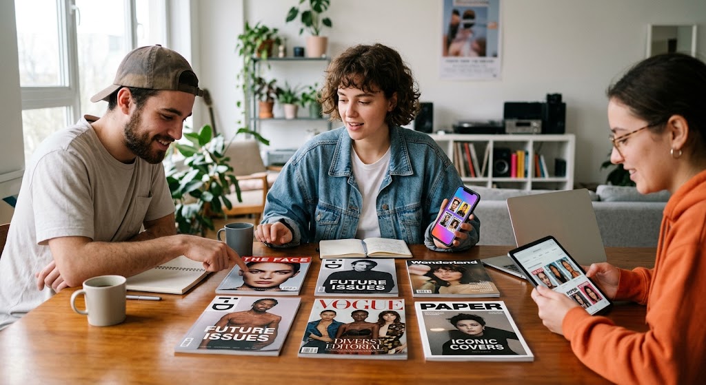
Through the print era a magazine cover was a physical object on a newsstand. It had one job: make a stranger pick it up. Didone type did that job by signalling taste before anyone read a word.
Today most “covers” are rectangles on a phone. A profile header, a banner, a thumbnail in a grid. They still have one job, to make a stranger stop scrolling, and designers are reaching for the same tools to do it.
Read the trend report’s practical advice and it reads like a brief for a personal brand. Reserve the dramatic serif for one statement line. Give it white space. Pair it with a plain sans serif for everything else. On social media, keep phrases short and set them in capitals.
That is exactly how a lot of independent creators already present themselves: one confident name, one line of description, a grid of images underneath. The masthead has become a person.
The newsstand moved too
If the profile is the new cover, the newsstand has also changed form.
A newsstand was a curated wall. Someone decided which titles got shelf space and in which order, and the reader browsed by category: fashion here, sport there, news at the front. Online, that role has passed to directories and catalogues that gather individual creators into browsable categories.
Subscription platforms built for creators, OnlyFans among them, are organised around individual pages rather than shelves, so much of the shelf-building happens elsewhere. A directory such as SpicyCreator arranges creators into categories and countries, which makes it, in design terms, a newsstand made of covers: dozens of personal mastheads competing for a glance on the same screen.
That comparison has limits worth keeping in mind. Nobody at a listing site art-directs the covers it shows; it neither commissions nor designs them, and the typographic choices on each profile belong to the creator. What it shares with the newsstand is the problem of the wall, not the craft of the cover.
Why the serif keeps winning
There is a deeper reason the Didone keeps returning, and the trend reports hint at it. VistaPrint’s own summary for 2026 is that personality and imperfection stand out because the market is “flooded with overly polished sameness.” The same report lists softened, rounded letters and deliberately smudged halftone effects alongside the glossy serif.
Monotype’s annual type-trends report pointed the same way from another angle, Creative Bloq reported, arguing that AI tools will bring custom type to many more people while the foundry pledged not to train AI on its partners’ fonts. When anyone can generate a decent layout, a typeface with a recognisable history becomes a way of signalling that a human made a choice.
The Didone does that better than almost anything. It is the typographic equivalent of good tailoring: unmistakable, slightly demanding and associated with people who know what they are doing.
A very old answer to a new question
Two centuries ago, Didot and Bodoni were solving a printing problem: how to make letters look precise and modern on better paper. Fashion magazines borrowed their answer because it looked expensive.
The question now is how to make a single name stand out among thousands on a screen. Designers keep giving the same answer.
The cover changed shape. The way we tell a stranger “this is worth a look” did not.