
Why good visuals and decent typography actually drive growth
Here’s the thing: people decide really fast if a website feels legit or not. Like, in a split second. Before they read anything, they already feel either “this looks premium” or “something’s off”. You don’t get a second chance at that first impression, and most of it has nothing to do with your product itself — it’s all about how it’s presented. And if your visuals aren’t sharp enough, it’s easier than ever to fix that now — tools like https://imageupscaler.com/enhance-image/ show how even simple images can be quickly improved and made to look clean and professional.
A lot of founders spend weeks or even months polishing features, fixing bugs, improving logistics… but kind of ignore how everything looks. Which is a mistake. Because fonts and images are the first thing people notice. If the font looks random, outdated, or just hard to read, it creates friction. If an image is blurry or stretched — same story. Trust drops instantly, even if everything behind the scenes is actually solid.
Nobody literally thinks “oh, I see pixels here,” but the brain registers it anyway. It translates into a simple feeling: this doesn’t feel high-quality.
Image quality matters more than people think
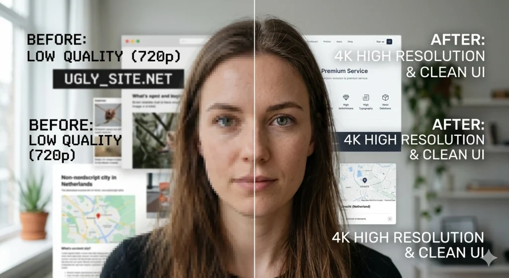
Bad images don’t just look average — they actively hurt your brand. It’s like a quiet red flag that says “details are not important here”.
People naturally assume: if the visuals are sloppy, the service might be too. It’s not always fair, but it’s how perception works.
The good part is that today there’s really no excuse. AI tools can improve image quality, upscale resolution, reduce noise — all in a few clicks. You don’t need a professional studio for every single asset. Even a decent photo can be upgraded to look sharp and clean.
Also, consistency matters. Your visuals should look good everywhere — on a phone, tablet, or large desktop screen. If something looks crisp on mobile but falls apart on a bigger display, it breaks the overall experience. And once the experience breaks, trust goes with it.
How to build a clean, solid design

It’s less about money and more about discipline and attention to detail.
Fonts
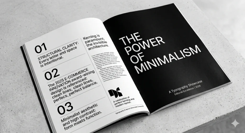
Just pick something simple and readable. Seriously. If your brand is modern — go with a clean sans-serif. If it’s more classic or elegant — serif can work. But readability always comes first. If people have to “try” to read your text, they won’t.
Images
Don’t use visuals just to fill space. Every image should support your message. If you’re talking about speed, energy, or innovation — the visual should reflect that. Random stock photos with no connection to your content just weaken the message.
Quality
Never upload raw images straight from a camera or screenshot. Take a minute to clean them up: adjust sharpness, fix lighting, improve resolution if needed. These small steps make a huge difference in how professional everything feels.
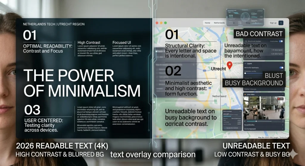
Text on images
This is one of the most common mistakes. Text placed over a busy background becomes unreadable. If the message is important — make sure it stands out. Add contrast, darken the background slightly, or blur it just enough so the text is clear.
Tools that make this easier
You don’t need anything complicated:
Fontmirror — helps you find better font combinations
ImageUpscaler — improves image clarity and resolution
Canva or Figma — simple tools to design layouts and keep everything consistent
Final thought

People are overloaded with content. Every day they scroll through hundreds of visuals, ads, pages. If your design looks average – it disappears. If it looks messy – it gets ignored even faster. But when everything looks clean, sharp, and intentional – people notice. And more importantly, they trust it. What’s interesting is that small details do most of the work: spacing between letters, alignment, image sharpness, contrast, consistency across pages. These things are almost invisible when done right, but very obvious when done wrong.
Features can be copied. Prices can be matched. But the feeling of quality – that’s much harder to replicate. Because sometimes a single blurry banner or poorly chosen font is enough to lose a potential customer before they even read what you’re offering. Visit the site to see examples of high-quality design.
![Best Email Marketing Options Reviewed [Feature Table Inside]](https://www.fontmirror.com/en/wp-content/uploads/2025/10/Email-Marketing-Options-768x511.jpg)