The Impact of Typography on User Experience in Online Catalogs
When we think about user experience in web catalogs, the first things that come to mind are typically images, design, product categorization, or interactive elements. But there’s another element quietly in the background, affecting how customers feel, navigate, and engage with your content — typography.
Typography in an e-catalog is not nearly so much about picking a pretty face. It plays a direct role in the user experience. How text is delivered on the page — size, style, weight, and space — can guide a customer’s eye, generate feeling, build trust, and influence purchasing decisions.
In the world of online catalogs, where you have mere seconds to capture a person’s attention, good typography isn’t just a matter of course — it’s vital.
Typography as the Invisible Guide
Most users won’t even notice good typography. And that is the whole idea. Great typography quietly organizes information in a way where people can easily read content without frustration or effort.
But bad typography? That immediately grabs attention.
If fonts are too small, too elaborate, poorly spaced, or inconsistent, customers begin to feel confused or lost. Reading becomes a chore rather than an organic process. In online catalogs, where the goal is generally to promote browsing, discovery, and ultimately purchase, these subtle barriers can produce major consequences: higher bounce rates, lower engagement, and lost sales.
Typography is, at its essence, a means of communication. And communication that looks as clear, friendly, and visually smooth as possible keeps users hanging around longer, clicking more, and trusting the brand behind the words.
Emotion Through Typeface
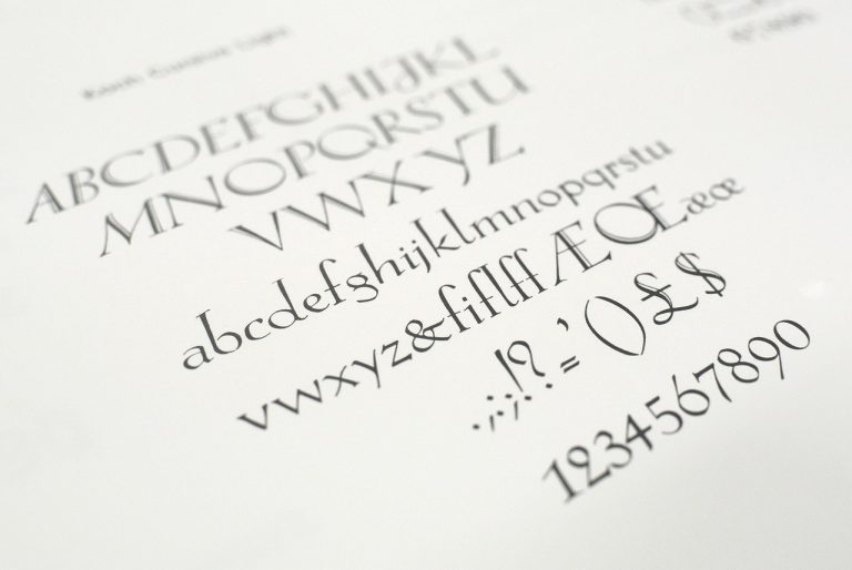
Fonts have emotional significance. Serif fonts feel traditional and reliable, while sans-serif fonts tend to feel clean and contemporary. Handwritten or script fonts feel personal and innovative, while bold display fonts feel strong and commanding.
This emotional impact is most important in web directories because customers aren’t just reading data — they’re absorbing your brand personality.
Typography establishes the tone in which your brand and products are perceived. Are you minimalist and high-end? Are you fun and playful? Are you classic and reliable? Fonts express all that even before any product description is read.
It’s why most luxury brands lean toward refined, spacious serif fonts, and lifestyle brands targeting younger consumers may use bold sans-serif or quirky display fonts. The font is part of the brand voice — it speaks visually with your imagery and layout.
The Practical Side of Typography: Readability Drives Action
While aesthetics are central, online catalogs always play a functional role as well: navigating customers through products, understanding details, and enabling action.
Here is where typography must balance aesthetics with function.
Readability is king online. No matter how lovely a typeface is in theory, if consumers find it difficult to read — especially on mobile — it creates friction for their experience.
Font size, line spacing, contrast from the background, and decent hierarchy all come into consideration here. Product names must be scannable immediately. Prices must be clear. Descriptions must be readable without appearing crowded or dense.
On digital catalogs, simplicity is assurance. When consumers can digest information more quickly, they’ll be more sure of making decisions. Typography takes away the uncertainty.
Responsive Typography for a Seamless Experience
The second major problem for web catalogs is designing for several devices. What looks lovely on a desktop screen can be cramped or unreadable on a cell phone.
Responsive typography — the process of adapting font sizes, spacing, and layout for varying screen sizes — makes your catalog feel just as refined on any device.
Luckily, the platforms nowadays make it easier than ever. If you want to avoid the technical headache of coding responsive type yourself, there are tools available that help you build it online effortlessly. Platforms like Publitas are designed specifically for creating digital catalogs that look beautiful and function smoothly, regardless of screen size.
With built-in design options and mobile-friendly features, these tools take much of the complexity out of responsive typography, letting brands focus on creativity and content instead.
Typography Builds Trust
Beyond readability and sensation, typography in e-catalogs performs another subtle but powerful role: it builds trust.
Consistency in typefaces, type sizes, and type styles communicates professionalism and attention to detail. When all elements of your catalog look and feel related, customers naturally trust your brand more. On the other hand, jarring font changes, awkward spacing, or misaligned text give the impression that a brand is not sophisticated — or, even worse, not trustworthy.
Trust is a fragile thing in eCommerce. Online shoppers are suspicious by nature. They require visual cues that a brand is professional, cares about the customer experience, and offers quality. Thoughtful typography helps to communicate that perception.
It also makes your catalog more usable. Clear typefaces, sufficient contrast, and rational text hierarchy render your catalog more usable for more people, including those with visual disabilities or reading difficulties. In today’s day and age, accessibility is not just good design — it’s good business.
Typography as Part of the Customer Journey
At every step of the user experience within an online catalog, typography comes into play.
Typography takes center stage on the cover page. It navigates users via category sections. It indicates promotions or highlighted products. It illustrates product details. It calls users to action through buttons like “Add to Cart” or “Learn More.”
Every one of these scenes is based on font decisions that are intuitive and thoughtful.
Typography even affects the mood of surfing itself. Spaciousness and plain lines instill a mood of calm and focus. Cramped, condensed type is dynamic or, when overused, tense. Reading rhythm in a catalog experience needs to mirror the mood your brand aims to create.
Are you inviting customers to hang around and browse? Or are you making them enthusiastic and rushed? Typography does assist in controlling pace.
The Future of Typography in Online Catalogs
As the future of online catalogs becomes more interactive and complex, typography can only continue to improve. Variable fonts, motion type, and responsive animations are now being employed as everyday tools by brands who are keen to create compelling digital experiences.
But at its core, the fundamental purpose of typography in web directories won’t change: to make customers feel something, know something, and do something.
The brands that pay attention to these small design details — that understand typography isn’t just decoration but strategy — will be the ones that stand out in an increasingly crowded digital world.
Typography in web catalogs is all about creating a visual language. It’s about taking friction out, establishing trust, and moving users smoothly from curiosity to connection to conversion.
With that many customers having infinite options, that sort of experience counts for all the difference in this world.