
How Typography Impacts Website SEO and Performance
Many website owners and marketers view typography strictly as a design choice and just another way to make a site look pretty or “on-brand.”
While aesthetics are important, typography plays a much more functional role in your site’s ecosystem. It influences how fast your page loads, how readable your content is, and how users interact with your brand.
This guide will break down exactly how typography impacts your SEO performance and what you can do to turn your text into a ranking asset rather than a liability.
Why Typography Affects SEO and Performance
Search engines have evolved. They no longer just scan for keywords; they simulate how a human user experiences a webpage.
Typography intersects with SEO in three major ways:
- Readability and Dwell Time
- Core Web Vitals and Page Speed
- Visual Stability
Readability and Dwell Time
Google’s primary goal is to provide users with the best answer to their query. If a user clicks on your link but finds a wall of tiny, cramped text that is impossible to read, they will hit the “back” button immediately.
Search engines interpret this as a sign that your content didn’t satisfy the user’s intent, which can hurt your rankings over time.
Good typography keeps readers on the page longer, signaling that your content is valuable.
Core Web Vitals and Page Speed
Fonts are software files that your browser has to download. If you are loading five different font families with multiple weights (bold, italics, semi-bold, etc.), you are forcing the user’s browser to download a massive amount of data before the page can display text.
This directly impacts your Largest Contentful Paint (LCP), a Core Web Vital that measures how long it takes for the main content of a page to load. Heavy font files slow this down significantly.

Visual Stability
Have you ever visited a website and tried to click a button, only for the text to pop in a split second later, shifting the layout and making you click the wrong thing?
This is called Cumulative Layout Shift (CLS), another critical Core Web Vital.
It often happens when a custom font loads later than the rest of the design, pushing content around. Search engines penalize sites with poor visual stability because it creates a frustrating user experience.
How to Audit Typography’s SEO Impact
How to Audit Typography’s SEO Impact
A good starting point is using SEO audit tools like SEOptimer or Google PageSpeed Insights. These tools assess metrics like LCP, CLS, and font legibility across devices.
After identifying typography-related issues, you can create an actionable SEO plan—especially important if you’re working with a Link Building Agency that wants to ensure your on-site SEO is just as strong as your backlink profile. Addressing these technical aspects builds a stronger foundation for link-building success.
TrioSEO specializes in this holistic approach, ensuring that your content and site architecture are fully optimized to maximize the impact of every high-quality backlink you earn.
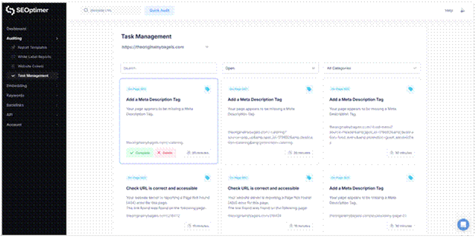
If the audit highlights areas for improvement, the results can be turned into an actionable plan using an SEO task management tool. An SEO task manager shows you which tasks are most important and helps users track critical SEO fixes, such as layout or readability issues.
Common Typography Mistakes That Hurt SEO
Even well-intentioned designers can make mistakes that inadvertently sabotage SEO efforts. Here are the most common pitfalls to watch out for:
Using Too Many Font Variations
It is tempting to use a unique font for headers, another for body text, and a third for call-to-action buttons. However, every new font style adds HTTP requests and increases page load time.
The SEO impact: Slower page speeds and higher abandonment rates, especially on mobile devices with slower connections.
Ignoring Mobile Responsiveness
Text that looks elegant on a 27-inch monitor often turns into microscopic ants on a smartphone screen. If users have to pinch-to-zoom to read your blog, your site is not mobile-friendly.
The SEO impact: Google uses mobile-first indexing, meaning it looks at the mobile version of your site to determine rankings. Non-responsive typography is a major ranking risk.
Poor Contrast Ratios
Light grey text on a white background might look “minimalist” and trendy, but it is a nightmare for accessibility. If users with visual impairments—or even just users in a bright room—cannot read your text, you are alienating a huge portion of your audience.
The SEO impact: Accessibility is increasingly becoming a proxy for quality. Low contrast hurts readability and engagement metrics.
Flash of Invisible Text (FOIT)
This occurs when the browser hides the text until the custom font is fully downloaded. Users stare at a blank screen for seconds, unsure if the site is broken.
The SEO impact: It creates a perceived performance lag. Users are likely to bounce if they don’t see content immediately.
Best Practices for Typography With SEO in Mind
Optimizing your typography doesn’t mean you have to sacrifice style. You can have a beautiful site that ranks well by following these best practices.
1. Use Modern File Formats
Stop using TTF (TrueType Font) or OTF (OpenType Font) formats for the web. They are bulky and uncompressed.
The Fix: Switch to WOFF2 (Web Open Font Format 2). It offers superior compression, meaning smaller file sizes and faster load times, and is supported by all modern browsers.
2. Stick to a Standard Hierarchy
Search engines use heading tags (H1, H2, H3) to understand the structure and topic of your content. Your typography should visually match this hierarchy.
The Fix: Ensure your H1 is the largest, most prominent text. H2s should be slightly smaller, and H3s smaller yet. This helps both users and search bots scan your content efficiently.
3. Limit Font Weights
Do you really need “Thin,” “Extra Light,” “Light,” “Regular,” “Medium,” “Semi-bold,” “Bold,” “Extra Bold,” and “Black” weights?
Probably not.
The Fix: Stick to two or three weights maximum (e.g., Regular and Bold). This significantly reduces the data payload.
4. Preload Critical Fonts
If a specific font is used for your main headline (H1) and is essential for the page’s visual stability, you can tell the browser to prioritize it.
The Fix: Use the <link rel=”preload”> tag in your site’s code for your most critical font files. This ensures the font starts downloading early in the process, reducing layout shifts.
Improving Your Site, One Letter at a Time
By choosing the right fonts, optimizing how they load, and ensuring they are readable for everyone, you are not only improving design, but also building a foundation for higher rankings.