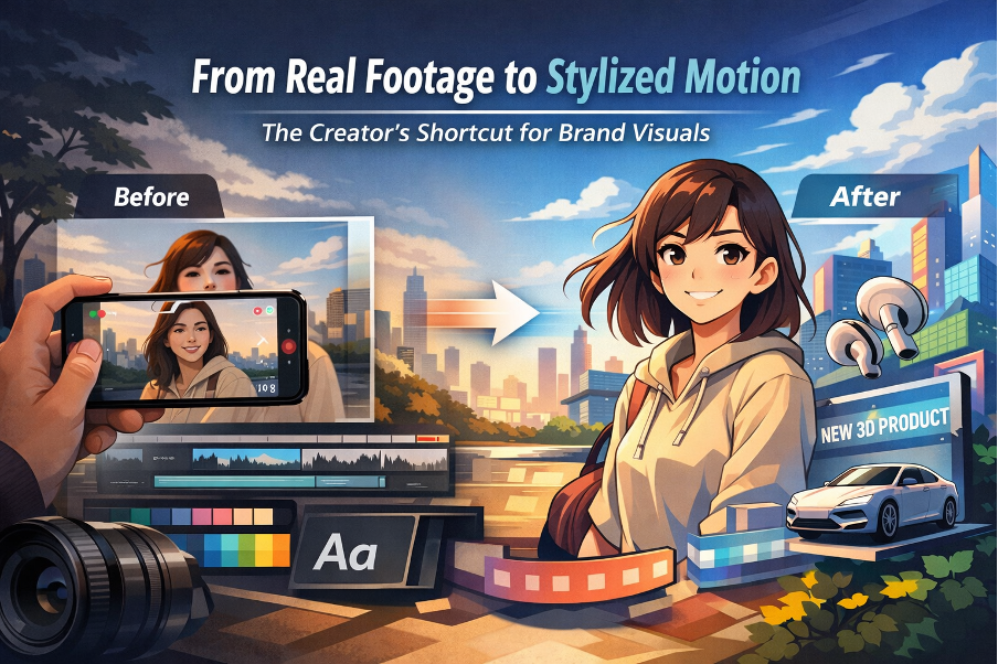
From Real Footage to Stylized Motion: The Creator’s Shortcut for Brand Visuals
Most brand videos don’t fail because they look “low quality.” They fail because they don’t look designed. I learned that the hard way after shipping a few campaigns where the typography was tight, the layout was clean, and the color palette was consistent—then the moment I dropped in raw footage, the whole page felt like a collage. The lighting didn’t match the brand mood, the background was busy, and the clip had that “random phone video” energy that fought everything around it.
That’s when animation-style conversions started to make sense to me. Not as a gimmick, not as “turn everything into cartoons,” but as a way to make footage behave like a design layer: simpler shapes, cleaner separation, more predictable texture. The goal is boring in a good way—repeatable, brand-safe, easy to place next to type.
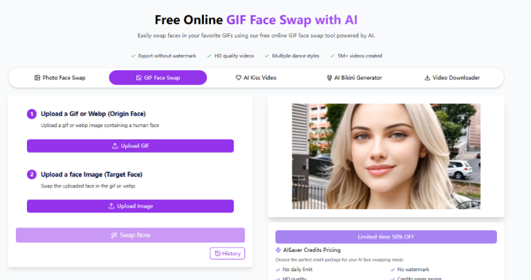
“If you’re exploring stylized motion for brand content, GoEnhance is a solid hub to start testing different looks without overcomplicating your workflow.”
What I’m sharing here is the checklist I use when I need clips that feel intentional—something I can confidently publish on a landing page, in an ad, or in a reel without it breaking the visual system.
Why “animation-style video” reads better for brand visuals
Raw footage asks viewers to judge it like reality. That’s a losing game if your input isn’t perfect. Stylized motion changes the evaluation rules. People read it as an art direction choice, which means they’re more forgiving of imperfect lighting or background mess—as long as the look stays coherent.
The biggest win for me is focus. Stylization can quiet the noise: fewer distracting micro-details, clearer subject edges, smoother backgrounds. That pairs naturally with typography. When I place a headline on top of a stylized clip, it’s more likely to feel like a poster or a product card, not a screenshot from someone’s camera roll.
It also survives social compression better. I’ve had real footage clips that looked fine on desktop but turned into muddy soup on mobile. Clean shapes and simplified gradients tend to hold up when platforms crush the bitrate.
Select a Style Direction (Anime / Toon / Illustrated / Clean 3D)
Early on, my mistake was “vibe-shopping.” I’d run the same footage through a few looks and pick whatever felt coolest. The result: a feed that looked inconsistent week to week. Now I pick a target style the same way I pick a typeface: based on purpose and constraints.
Here’s the quick guide I use:
| Style target | What it’s good for | What I watch out for | Best fits |
| Anime | Strong linework, expressive character energy | Shimmering outlines in motion, twitchy hair edges | Creator intros, character-led reels |
| Toon / Cartoon | Friendly, high contrast, simple forms | “Plastic” skin, overly smooth faces | Fun ads, light explainers |
| Illustrated | Editorial feel, softer texture, premium mood | Detail melting during fast movement | Brand storytelling, slower pacing |
| Clean 3D / Semi-real | Product-friendly polish, controlled lighting | Uncanny faces if input is weak | Product pages, app promos |
If the clip has faces, I choose the style around faces, not backgrounds. A pretty scene is meaningless if eyes drift, mouths warp, or skin turns waxy. For products, I do the opposite: I judge materials and edges first—glass reflections, metal highlights, label legibility.
My rule is simple: the more “conversion-critical” the clip is (pricing, product UI, strong CTA), the cleaner the style target.
Keep typography and motion design consistent
This is where most “stylized” brand content still looks amateur: the text overlay. I treat text like part of the system, not decoration.
A few habits that saved me time:
- I keep type families minimal. If the brand has a font system, I stick to it.
- I lock text zones. Headlines live in the same area across multiple clips. When text jumps around, everything feels unstable.
- I match stroke weight to font weight. Bold outlines with thin type looks fragile; painterly looks with heavy black type feels slapped on.
- I animate like a designer: gentle fades, clean slides, subtle scale. If the motion calls attention to itself, readability drops.
If I’m unsure, I export a still frame and design it like a poster. If it doesn’t work as a static layout, it won’t magically work in motion.
A simple quality checklist: edges, faces, and scene stability
I don’t approve a clip based on a single frame anymore. I watch it at normal speed, then scrub the timeline and look for three things: edge stability, face stability, and scene stability.
Edges
- Do outlines shimmer when the subject moves?
- Do hands and hair keep their shape, or “crawl” frame to frame?
- Do high-contrast boundaries (jawline, collar, product edge) stay clean?
Faces
- Do eyes stay consistent in size and position?
- Does the mouth area deform during speech or smiles?
- Does skin look intentionally stylized, not smeared?
Scene stability
- Does the background hold, or morph unpredictably?
- Do important details (logos, labels, UI elements) survive?
- Does lighting pulse or flicker?
When something breaks, it’s usually the input. Low light, heavy motion blur, extreme angles, or low resolution will punish you. If I can re-shoot, I fix the source. If I can’t, I shorten the shot, reduce movement, or pick a style that hides weaknesses.
“For the specific ‘footage → animated look’ jump, a video to animation converter is the fastest way to produce shareable results you can actually publish.”
Where These Clips Land Best: Intros, Ads, Reels, and Product Pages
Once I have a stable look, stylized clips become a flexible asset class.
- Intros: I keep them short and recognizable in the first second. It’s branding, not a short film.
- Ads: Clarity wins. Stable product shots, readable text, and clean pacing beat fancy rendering every time.
- Reels: Stylization helps you stand out, but rhythm matters more. Minimal text, strong hook, clean cuts.
- Product pages: Great for unifying mismatched footage from different shoots. I keep it clean and avoid heavy distortion so the product silhouette stays honest.
The biggest shift for me was treating this like a repeatable system. I document two things for every brand: the style target and the typography rules. That’s what turns “cool results” into something you can ship weekly without reinventing the wheel.
If you want one takeaway: stylization isn’t the finish line. Consistency is. When the clip supports the type, the layout, and the brand tone, it stops being a trick—and starts being design.