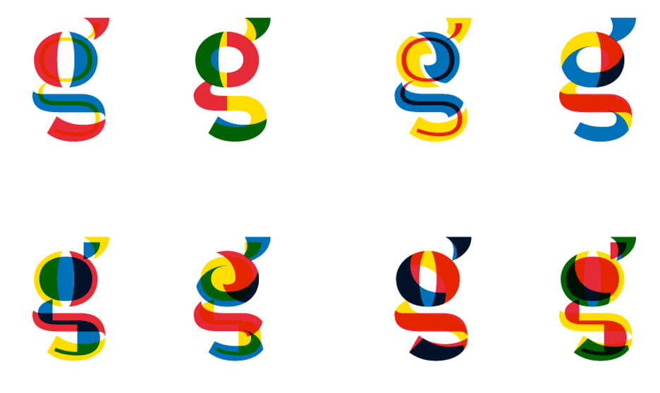
Color Theory in Typography: Balancing Contrast for Accessibility and Aesthetic
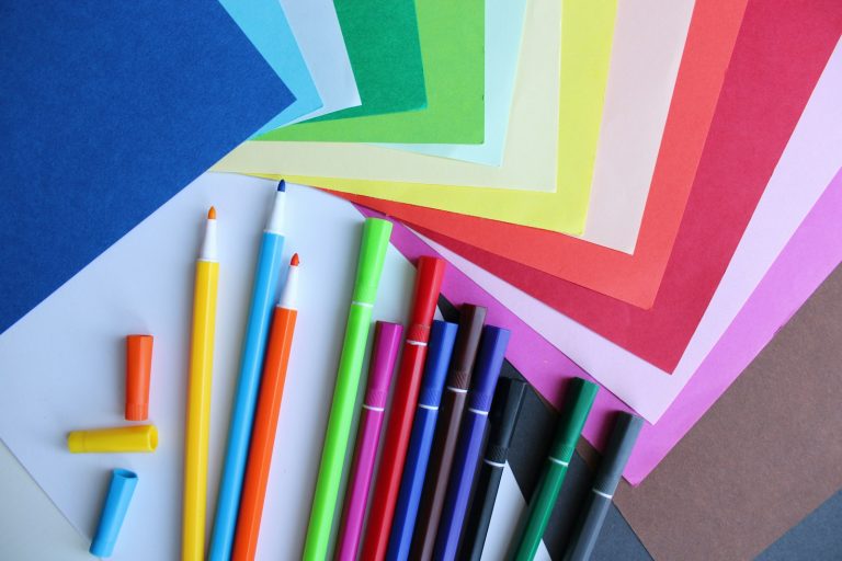
Typography goes beyond choosing beautiful fonts; it is about balancing readability and visual appeal using color theory. The right color contrast improves accessibility for users with visual impairments while enhancing the overall design experience. Understanding WCAG contrast ratio guidelines, pairing colors effectively, and designing for both light and dark modes can elevate text usability and aesthetics. This article explores the science and artistry behind typography colors, focusing on readability, emotional tone, and real-world testing methods that help designers create visually inclusive and engaging experiences.
Understanding Contrast Ratios and Accessibility Tools
The Web Content Accessibility Guidelines (WCAG) set global benchmarks for readability. For normal body text, a minimum contrast ratio of 4.5:1 between text and background colors is required, while 3:1 suffices for larger text above 18pt or 14pt bold. These numbers are vital because they ensure users with mild to moderate visual impairments can comfortably read content across devices. Tools like the WebAIM Contrast Checker allow designers to test real-time color combinations and confirm compliance with accessibility standards.
Examples of Effective Dark/Light Color Pairings
One of the most effective design techniques is pairing #000000 (pure black) with #FFFFFF (pure white), producing a 21:1 contrast ratio, which far exceeds WCAG requirements. However, this is not always visually appealing or comfortable for prolonged reading. More balanced pairings, such as #1A1A1A with #F5F5F5, achieve a 15:1 ratio while being gentler on the eyes. Accessibility-focused designers leverage palettes that harmonize readability and aesthetics, ensuring visual comfort without sacrificing usability.
Visual Hierarchy and Emotional Tone Conveyed Through Color
Typography color choices influence perception and emotional response. Warm hues like #E63946 evoke urgency and energy, making them ideal for headlines or calls to action. Conversely, cool tones like #457B9D foster calmness and trust, perfect for body text in healthcare or educational designs. Establishing a visual hierarchy through deliberate contrast ensures that readers intuitively understand which information is most important.
Promotions and highlights in digital spaces follow the same logic. Whether it’s a call-to-action button, a limited-time offer, or a Casino welcome bonus, designers rely on accent colors that stand out just enough to capture attention without overwhelming the page. Using tones that balance visibility with harmony—often around a 7:1 contrast ratio—ensures that these elements remain engaging while keeping the overall design accessible and user-friendly.
Designing for Dark Mode vs. Light Mode
Dark mode interfaces have gained widespread popularity, but maintaining optimal readability in both modes requires thoughtful color selection. For dark backgrounds, using lighter shades like #EAEAEA or #F1F1F1 provides contrast without creating visual fatigue. Light mode, conversely, benefits from mid-range grays like #2D2D2D instead of stark black, maintaining clarity while softening eye strain. Adhering to WCAG guidelines ensures consistency and accessibility regardless of viewing preferences.
Simulated Overlays to Test Real-World Viewing Scenarios
Environmental conditions like sunlight, low lighting, or tinted screens can drastically affect perceived contrast. Tools such as Color Oracle simulate various forms of color blindness, including protanopia, deuteranopia, and tritanopia, helping designers anticipate real-world scenarios. By testing designs under different overlays, creators can ensure inclusive typography that remains legible across diverse environments and user capabilities.
Achieving Optimal Readability Without Sacrificing Style
Typography design thrives when visual creativity meets usability. Designers often use semi-transparent overlays, gradient text, or accent highlights to enrich aesthetics while preserving functional clarity. Techniques like layering text over blurred backgrounds ensure readability even in dynamic layouts. Using responsive typography tools also guarantees consistency across devices, keeping contrast ratios intact while adapting font sizes and spacing seamlessly.
Enhancing Brand Identity Through Color Choices
Color in typography directly influences brand perception. Platforms like Apple, Google, and Spotify maintain strict typographic guidelines, ensuring their text colors deliver the same emotional message across websites, apps, and marketing materials. For example, Spotify’s green #1DB954 paired with dark typography fosters instant recognition while maintaining accessibility standards. Adopting a consistent color language strengthens trust and user engagement.
Pairing Complementary Colors for Maximum Impact
Designers use the color wheel to find complementary pairs, like #0057FF (blue) and #FFAA00 (amber), which naturally maximize contrast without clashing. Triadic schemes, such as combining primary colors (red, blue, yellow), create vibrant, balanced typography layouts. These techniques ensure readers’ attention is directed toward critical information while maintaining an engaging visual flow.
Future Trends in Accessible Typography
With AI-driven personalization, modern typography tools are evolving to adjust contrast dynamically based on user preferences and environmental data. Future web standards could integrate machine learning to automatically switch palettes between 8:1 for outdoor brightness and 5:1 for indoor comfort. This intelligent adaptability ensures inclusive reading experiences and allows brands to personalize interfaces while staying compliant with accessibility guidelines.
Final Thoughts
Balancing accessibility and aesthetics in typography demands more than picking attractive colors—it requires understanding the science behind contrast ratios, psychological influence, and adaptive design. From pairing hues effectively for both light and dark modes to testing real-world scenarios with overlays, successful typography delivers usability without sacrificing creativity. Integrating subtle highlights like a Casino welcome bonus while adhering to WCAG principles displays how visual strategy and inclusivity can coexist beautifully.