Winning Typography Tips for Modern Sports Websites
If you are building a sports website whether it is for a team league news outlet athlete brand or sports media platform fonts matter more than most people realize. Sports websites live in a fast paced emotional world. Fans want energy clarity and confidence. The wrong font can make a site feel outdated soft or hard to read. The right font can instantly communicate strength excitement and professionalism.
Fonts do not just carry words. They carry attitude. A bold condensed headline can feel like a game day poster. A clean readable body font keeps fans scrolling through stats recaps and schedules without friction. In this guide we will walk through practical tips for choosing fonts that actually work for sports websites without overthinking it or turning it into a design science project.
Start With Readability Before Style
Sports fans move fast. They skim scores, scroll stats and jump between articles. If your font slows them down they will leave. Before you think about style, personality or branding make sure your font is easy to read on every screen.
For body text choose a simple sans serif font. Fonts like Inter Roboto Open Sans Source Sans Pro and Lato work extremely well for sports sites. They are clean, modern and readable even at small sizes. These fonts are especially good for long articles, player profiles and news updates.
Avoid decorative fonts for body text. Script handwritten or overly stylized fonts might look cool in a logo but they quickly become exhausting when reading paragraphs. Sports content is dense and information heavy so clarity always wins.
Use Bold Strong Fonts for Headlines
Headlines are where you can bring in power and emotion. Sports is loud, competitive and dramatic and your headline font should reflect that energy.
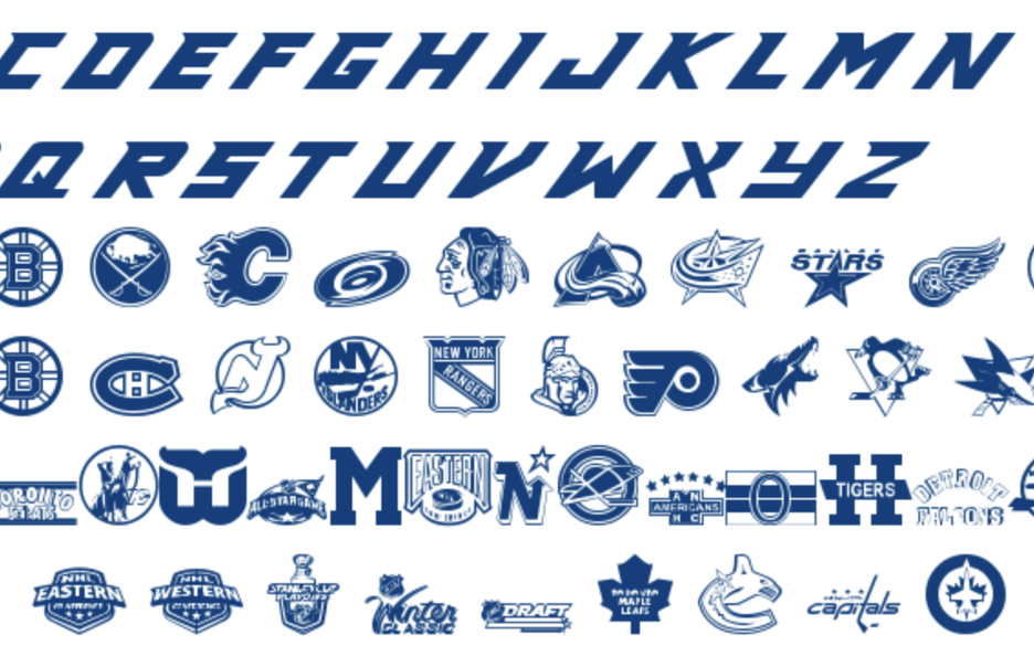
Condensed sans serif fonts are a favorite for sports headlines. Fonts like Oswald Bebas Neue Anton Teko and League Spartan feel strong and confident without sacrificing legibility. These fonts work well for match recaps breaking news and feature stories.
If your sport is high impact like football hockey or basketball lean into heavier fonts. For sports like soccer, tennis or cycling you can go slightly lighter but still bold. The key is contrast. Headlines should clearly stand apart from body text.
Limit Yourself to Two or Three Fonts Max
One of the most common mistakes on sports websites is using too many fonts. This creates visual chaos and makes the site feel unprofessional.
A simple setup works best. One font for headlines, one font for body text and optionally one accent font for things like stats pull quotes or navigation. Many successful sports sites even stick to just two fonts total.
Consistency builds trust. When fans visit your site regularly they should instantly recognize the look and feel. Too many fonts break that familiarity.
Match the Font to the Sport
Different sports carry different personalities and your font choices should reflect that.
For football hockey and basketball choose bold blocky fonts with strong vertical shapes. These fonts communicate toughness and intensity.
For soccer fonts can be clean, modern and slightly condensed. Think European magazine style with confidence but elegance.
For motorsports extreme sports and MMA you can push fonts a bit harder. Angular aggressive fonts work well here especially for headlines and logos.
For golf, tennis or Olympic sports lean toward refined modern fonts. Still strong but more polished and premium.
You do not need to reinvent the wheel. Look at professional league websites and major sports media platforms and study how they match fonts to their sport.
Pay Attention to Numbers and Stats
Sports websites live and die by numbers. Scores times rankings percentages and stats appear everywhere. Make sure the font you choose handles numbers cleanly.
Look closely at how numbers appear. Are zeros easy to distinguish from the letter O. Are ones clear or do they look like lowercase L. Do numbers align nicely in tables.
Some fonts are designed with data in mind. Inter and Roboto are great examples. They handle numeric data beautifully and make stats feel clean and professional.
If your site is heavy on analytics fantasy sports or live scores this matters more than you think.
Avoid All Caps for Long Text
All caps look great for short headlines, buttons and navigation. They feel bold and authoritative. But for longer text they are hard to read and tiring for the eyes.
Use all caps sparingly. Navigation menu items section headers and score labels are perfect places. Articles previews and descriptions should stay in the normal sentence case.
If you love the look of all caps make sure you increase letter spacing slightly. This improves readability and keeps the text from feeling cramped.
Make Mobile Your Priority
Most sports fans browse on their phones. They check scores while watching games, read news on the couch and scroll highlights on the go. Your font choices must work perfectly on small screens.
Test your fonts on mobile early. Some fonts that look great on desktop feel too thin or tight on phones. Others lose clarity at smaller sizes.
Choose fonts with multiple weights so you can adjust thickness without switching typefaces. Make sure line height is generous enough for comfortable reading on mobile.
If your site feels hard to read on a phone, no font choice on desktop will save it.
Do Not Ignore Line Height and Spacing
Fonts are not just about the letters themselves. Spacing plays a huge role in how readable and professional your site feels.
Increase line height for body text especially on articles. Sports content often includes long paragraphs and detailed breakdowns so breathing room matters.
Paragraph spacing should be consistent. Avoid walls of text. Break content into sections with subheadings to keep fans engaged.
Good spacing makes even simple fonts feel premium and intentional.
Pair Fonts With Purpose
When pairing fonts think contrast not similarity. If your headline font is bold and condensed choose a body font that is wider and calmer. If your headline font is heavy choose a lighter body font.
Avoid pairing fonts that look too similar. It can feel accidental rather than designed.
Google Fonts is an excellent resource for tested font pairings. Many popular combinations already work well together and are free to use.
Use Fonts to Reinforce Brand Identity
If your sports website represents a team league or brand your fonts should align with that identity.
A youth sports site might use friendlier rounded fonts. A professional league site should feel polished and authoritative. A sports betting or analytics platform should feel sharp and trustworthy.
Fonts play a big role in brand perception even if users cannot articulate why. The right font choice can make your site feel official, credible and established.
Do Not Overdo Custom Fonts
Custom fonts can be great but they come with tradeoffs. They can slow down load times, cause rendering issues or break on certain devices.
If you use a custom font make sure it is optimized for web use and backed up with a fallback font. Performance matters in sports. Fans expect fast updates and instant loading.
Many of the best sports sites use widely available web fonts and focus on layout content and imagery instead of flashy typography.
Test With Real Content
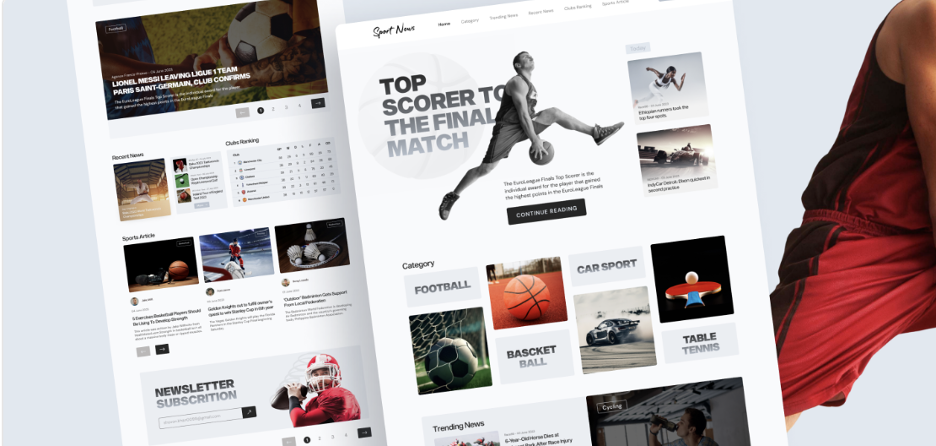
Fonts look different when filled with real sports content. Test your fonts with actual articles, photography (check the Vecteezy sports section) stats tables and headlines not placeholder text.
Look at how player names fit. Some names are long and need space. Look at how team abbreviations and scores align. Check how bold and italic styles look together.
What works in theory sometimes fails in practice. Testing early saves redesigns later.
Keep Accessibility in Mind
Sports should be accessible to everyone. Make sure your font sizes meet accessibility standards. Avoid light gray text on white backgrounds. Make sure contrast is strong enough for easy reading.
Choose fonts that remain readable for users with visual impairments. This is not just good practice, it also improves the overall user experience.
Accessibility friendly design almost always feels cleaner and more professional.
Learn From the Best Sports Websites
Take time to study top sports websites like ESPN The Athletic Bleacher Report league sites and major team pages. Notice how simple most of their font systems are.
They rely on strong headlines, clean body text and consistent hierarchy. They let images, videos and content do the heavy lifting while fonts support the experience.
You do not need to be flashy to be effective.
Getting started
Fonts might feel like a small design choice but on sports websites they carry serious weight. They affect readability, credibility, emotion and brand perception.
Keep things simple. Prioritize readability. Choose strong headline fonts and clean body text. Limit the number of fonts you use. Test everything on mobile. And always think about how real fans will experience your content.
If your fonts feel effortless, powerful and easy to read you are doing it right. Sports are already exciting. Your typography should support that energy not compete with it.