Typeface Trot: Discovering Fonts Inspired by Horse Racing and Speed
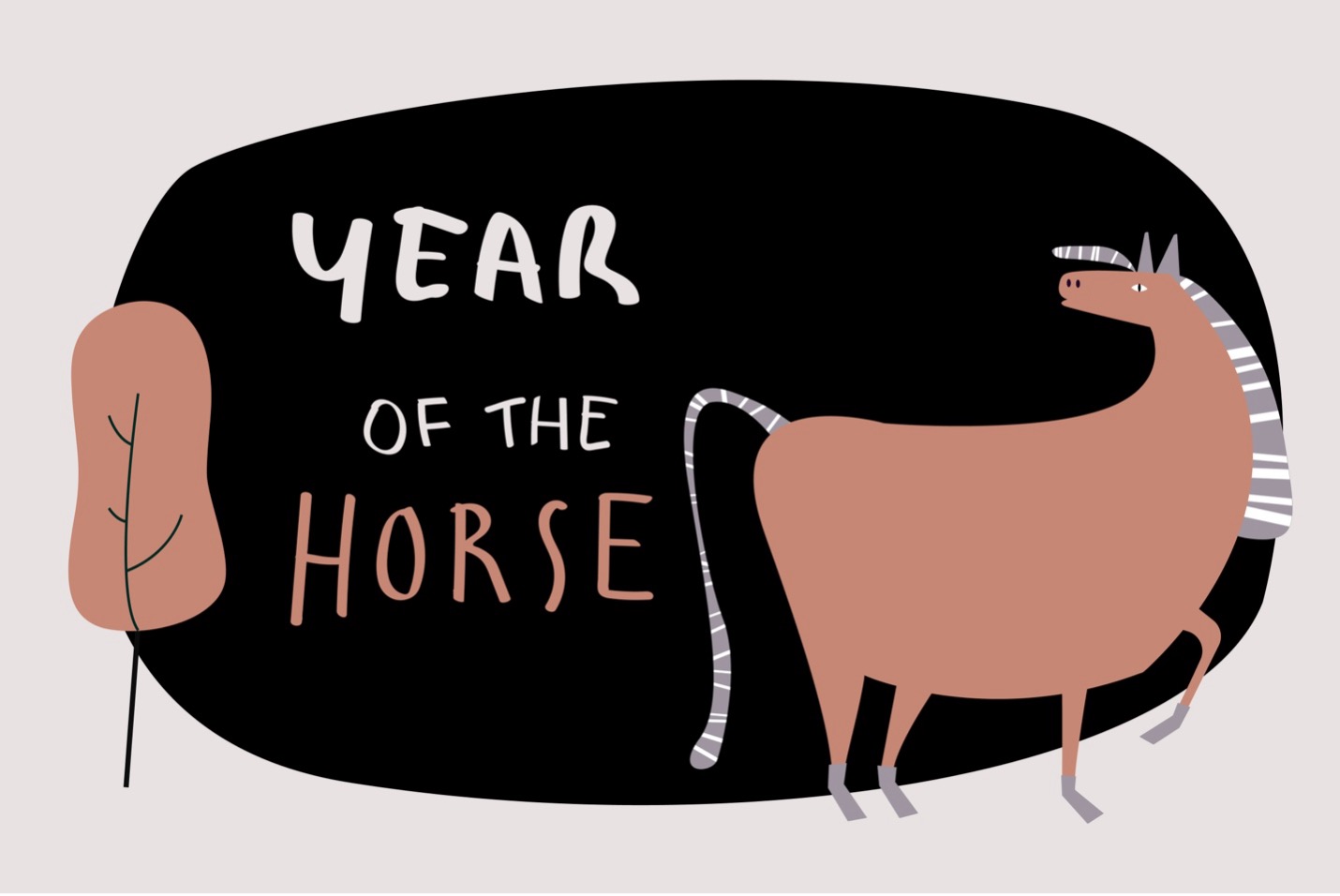
Photo: Image by rawpixel.com on Freepik.com
Fonts play a very important part in design. They allow you to evoke emotions, feelings and make a unique image for your brand that will live forever. They might be just lines shaped like letters, but there is more to the story than that.
Since fonts evoke emotions, people are always trying to connect them to certain places, events, or even sports like horse racing, when they are trying to tell a story. Horse racing is more than just a sport. It is a cultural phenomenon and something that has reshaped our civilization for thousands of years.
And guess what, the same sense of speed and grace has found its way into the world of typography.
Yes, there are plenty of fonts inspired by horse racing. Not just the motion of the race, but the feeling, the history that comes with the sport, and the overall culture. Brands that aim for that sophisticated and luxurious look are often the ones that end up using horse racing fonts.
So, which are the best fonts inspired by horse racing culture, and how can they help you bring your design to life?
The Spirit of Speed in Design
When designers talk about “speed,” they’re usually not referring to motion. They are talking about emotion. After all, how can you represent speed with a font? It’s hard since the letters will get blurry, and you don’t want that.
However, you can encourage that heart-pounding action or the feeling that speed evokes in humans. In typography, these emotions usually translate with sharp edges, slanted lines, and smooth, often aerodynamic shapes.
Think of how the “S” in some fonts leans forward slightly, or how italicized typefaces give off that forward momentum. It’s the visual version of a horse mid-stride.
These fonts often pull inspiration directly from racetracks, racing teams and participants, betting boards, jockey numbers, and vintage horse racing posters.
Touch of Classic Elegance
There is no doubt that horse racing is a classy sport, and we can see that through typography. Just look at some of the horse racing posters from decades ago. They look like art pieces – sophisticated and elegant.
Plus, horse racing as a sport sits in a unique category. It has always been considered a sport reserved for the elite, and it was always draped with prestige. On top of that, betting is a big part of the sport, which opens up a new direction in terms of design.
Horse racing betting culture is the main inspiration behind most of the horse racing fonts we find nowadays. But if you are new to betting, you’d better head to TwinSpires to learn more about bet types. The betting culture behind the sport is definitely a source of inspiration when it comes to horse racing designs.
Fonts like these often feature sweeping curves, engraved strokes, and serif embellishments that echo the elegance of thoroughbred breeding and polished trophies.
You’ll find this blend of luxury and speed in typefaces like Playfair Display, Cinzel, or Didot.
The Modern Motion Look
But just because horse racing is an age-old sport, it doesn’t mean that we are only focused on elegant and vintage fonts. Some horse racing-inspired fonts can also be modern with sliced angles and condensed widths.
Fonts like Orbitron, Ethnocentric, or Racing Sans One perfectly capture that futuristic, high-speed vibe. They feel sleek, modern, and built for momentum like Formula 1 cars on four legs.
Horse Racing Inspired Fonts
Jockey One
“Jockey One” is a font designed with a nod to historical racetrack lettering. Its designers were inspired by old Argentine signage used for horse racing tracks in the 1930s, and they developed a full typeface in Regular and Bold under a free (with commercial option) license. It carries that vintage equestrian charm and works great for headlines, posters, or branding tied to horse culture.
Madison 01
One script-style font called simply “Madison 01” offers a retro aesthetic that evokes some deep feelings. Just look at the font and tell us what the font reminds you of. I immediately think of circus and horse racing retro posters hung all around town.
Speed Racing
If you want something that speaks speed and motion, Speed Racing is a solid pick. Created by Vladimir Nikolic, it comes in multiple variants (regular, italic, negative, etc.). The font leans into the sense of acceleration and action, perfect for sports or racing-themed projects. Keep in mind the free version is generally for personal use, with commercial licenses available.
Speedrace
Another fast, angular font is Speedrace, available via DaFont.It’s bold, clean, and carries that “ready to break from the gate” vibe. Suitable for headings, banners, or any design where you want letters that feel like they’re leaning forward.
Racing Sans One
From Google Fonts comes Racing Sans One, a sans-serif typeface that has already been used in contexts involving speed, sport, and motion. Because it’s hosted on Google Fonts, it’s web-friendly and easier to embed in projects. Its proportions and shaping make it a balanced choice when you want readability plus energy.
So, the beauty of horse racing fons lies in how they connect two worlds. They bring feelings and emotions from the track and can make designs alive. Maybe you should test with some of these fonts on an upcoming design.


