How Fonts Shape User Experience in Digital Design
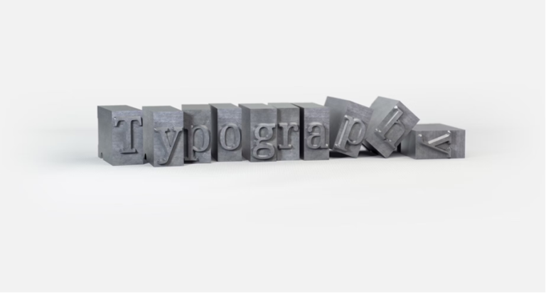
In digital design, fonts are often underestimated. They’re seen as a final touch—something decorative, secondary to layout or visuals. But in user experience (UX) design, fonts do much more than fill space with text. They influence readability, mood, trust, and even how users perceive a brand.
Every word on a screen is delivered through typography. Whether it’s a call-to-action button, a product description, or a headline, the font carrying that message either helps or hinders the user’s experience. Thoughtful typography builds clarity and comfort; poor choices create friction and confusion.
This article explores how fonts impact user experience, the psychology behind type choices, and how designers can use typography as a powerful UX tool—rather than just a visual afterthought.
The Psychology Behind Fonts
Fonts do more than convey information—they express personality. Subconsciously, users draw emotional cues from typography before they even start reading the content. Just as tone of voice influences how spoken words are received, font style affects how written words are perceived.
Serif fonts, with their small decorative strokes, often feel traditional, reliable, and formal. Think of brands in publishing or law—Times New Roman or Georgia evoke authority and heritage. Sans-serif fonts, by contrast, are cleaner and more modern. Fonts like Helvetica or Roboto feel straightforward and neutral, making them a go-to choice for tech companies and startups.
Display or decorative fonts can inject personality—playful, bold, artistic—but they should be used sparingly. Overuse or poor pairing of these fonts can make a site feel unprofessional or overwhelming.
What matters most is alignment with your brand and audience. If your app is helping users track mindfulness habits, a soft, rounded typeface can subtly support the product’s calming tone. If you’re designing for financial tools, clean sans-serif fonts offer clarity and professionalism. Fonts may be silent, but they’re constantly speaking to the user.
Readability and Accessibility in UX
A visually appealing font means little if users struggle to read it. At the core of UX design is the principle of usability—and in the context of typography, that begins with readability and accessibility.
Readability refers to how easily users can recognize words, phrases, and sentences. This is influenced by font size, line height, letter spacing, and contrast. Even a beautifully styled font becomes useless if it’s too small on mobile or crammed into tight layouts.
Accessibility goes further. It’s about making content usable for all, including people with visual impairments, dyslexia, or low vision. Fonts that are overly ornate or inconsistent can be a barrier. So can low-contrast text on busy backgrounds. Good design includes everyone.
Here are a few practical tips:
- Use a base font size of at least 16px for body text on desktop.
- Maintain sufficient contrast between text and background (a contrast ratio of at least 4.5:1 is recommended for normal text).
- Limit font weights and styles. Avoid using light gray thin fonts for anything important.
- Avoid all-caps in body text, which can be hard to scan.
- Use accessible-friendly fonts—typefaces like Inter, Open Sans, and Source Sans Pro are not only modern but also highly legible across devices.
DreamX, a UX/UI design and development company, emphasizes accessibility in its approach by testing typography choices under real-world conditions. It’s not just about what looks good in mockups—but what works for every user, in every context.
Ultimately, good typography in UX means meeting users where they are—ensuring content is easy to read, pleasant to follow, and frictionless to engage with.
Matching Font Choices to Brand and Audience
Fonts carry tone. Just like color and imagery, typography sets the mood and helps define how users feel about a brand. For UX designers, choosing the right font isn’t just an aesthetic decision—it’s a brand alignment strategy.
Imagine a legal tech startup using Comic Sans. Even if the functionality is sound, the font alone could damage credibility. On the other hand, a playful kids’ learning app using stiff corporate fonts might feel cold or uninviting. The key is choosing typefaces that reflect not only your brand values but also the mindset of your target audience.
Start by asking:
- What tone do we want to convey—formal, casual, elegant, bold, playful?
- Who are we designing for—enterprise clients, Gen Z consumers, global users?
- How does this font work across platforms—web, mobile, email?
For formal or high-trust industries (finance, health, legal), neutral sans-serifs or conservative serifs often work best. They communicate confidence without distraction.
For creative or lifestyle brands, more expressive fonts can reinforce uniqueness—but must be used with restraint. A distinctive heading font paired with a clean, legible body font often strikes the right balance.
And for startups aiming to look modern and scalable, fonts like Inter, DM Sans, or Manrope deliver clarity and a touch of sophistication without being cold or generic.
The font you choose becomes part of the user experience—it frames every interaction. When typography aligns with brand and user expectations, it builds a seamless bridge between identity and usability.
Responsive Typography for Better UX
In a multi-device world, typography must adapt—not just in appearance, but in performance. Fonts that look perfect on a 27-inch desktop can easily become cramped, broken, or unreadable on a phone. That’s where responsive typography comes in.
Responsive typography means your type adjusts to different screen sizes, resolutions, and reading environments. It’s not enough to scale the layout—text must scale intelligently to preserve readability and hierarchy.
Here are key principles to follow:
1. Use Relative Units
Avoid fixed pixel sizes. Instead, use relative units like em, rem, or %, which adapt better across breakpoints. This ensures that font sizes scale consistently with screen size and user preferences.
2. Set a Clear Type Scale
Create a type hierarchy with consistent step sizes between headings, subheadings, and body text. Using a modular scale (like 1.2x or 1.5x ratios) helps maintain balance and rhythm in your typography across devices.
3. Leverage Viewport-Based Sizing
CSS techniques like clamp() allow font sizes to grow or shrink between a minimum and maximum range based on the viewport width. This adds flexibility while keeping control.
font-size: clamp(1rem, 2vw, 1.5rem);
4. Test Across Devices
Responsive typography must be tested just like layout. Simulate various devices and orientations, and pay attention to line length, line height, and text wrapping.
5. Avoid Long Lines on Wide Screens
If lines stretch too far horizontally, they become difficult to read. Limit line length to 60–75 characters for body text, and adjust padding or max-width values to preserve this rule across breakpoints.
Responsive typography is not just about aesthetics—it’s essential to user comfort. When users don’t have to zoom, squint, or scroll horizontally to read, they stay longer, engage more, and bounce less.
Common Font Mistakes in UX Design and Final Thoughts
Even the most visually refined interfaces can fall apart with poor typography decisions. Let’s finish by highlighting frequent mistakes designers make—and how to avoid them.
1. Using Too Many Fonts
More than two or three fonts on a site often creates visual noise and confusion. Stick to one font family with multiple weights, or pair one display font for headings with a simple sans-serif for body text.
2. Ignoring System Fonts or Fallbacks
What happens if a user’s device can’t load your chosen font? Without proper fallbacks, your layout may break or default to something messy. Always define a clean fallback stack.
3. Prioritizing Style Over Substance
Trendy fonts may look great in a portfolio, but if they harm legibility, they hurt the user experience. Your font should always support, never distract from, the content.
4. Not Testing Across Devices and Languages
Some fonts render poorly on low-resolution screens or in languages with complex characters. Test thoroughly, especially if you serve a global audience.
5. Underestimating Font Licensing
Some fonts require paid licenses for web use. Failing to follow licensing rules can lead to legal issues or loading errors if the font is blocked.
Conclusion
Fonts are the silent layer of UX. They guide the eye, set the tone, and shape how users perceive your product—before they even know what it does. Typography should be treated with the same care as navigation, layout, or interaction design.
Whether you’re refining an MVP, scaling your product, or creating a fresh brand identity, make typography an intentional part of your UX process. Choose fonts that reflect your users, your values, and your goals. Test them in context. Let them serve the content, not compete with it.
In the end, great UX design is invisible. And great typography helps make it so.