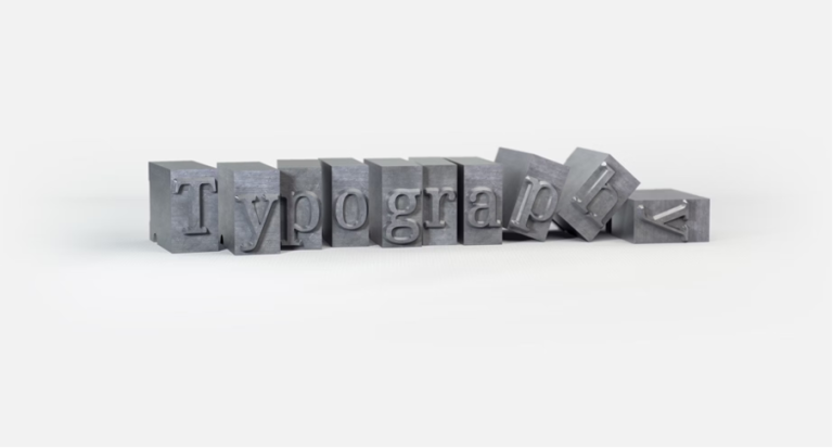
Choosing the Right Fonts for Mobile App Design
Mobile AI market, which is directly connected to the innovations of apps (on-device AI capabilities), is projected to increase by about 24.8 billion dollars in 2025 to about 81.2 billion dollars in 2030 (CAGR of approximately 28.6%).
In the competitive realm of mobile apps, design is neither about appearance nor style; it is communication. All components of your application interface create user experience, yet typography is one of the many factors that are frequently ignored. The fonts used in mobile app design may greatly influence the usability and readability, as well as the brand perception. Incorporation of good typography is no less important to the functionality of businesses that want to stand out. This is where a custom app development service will be useful, and your app will be fully functional, as well as effective in design communication.
Why Mobile App Design Matters in Fonts
Fonts are not mere letters on a screen; they possess personality, emotion, and dictate user behavior. The right font is essential in mobile apps because of the limited screen real estate, where you should be able to see the content, hierarchy is evident, and one must be able to navigate the interface. On the other hand, bad fonts may anger users and cause a lack of engagement that would have an eventual effect on retention rates.
With mobile users, reading is not as extensive as it is thorough, conciseness is the key. An overly ornamental font can be stylish, but it can negatively affect the readability, particularly on smaller displays. On the other hand, a simple font can be understandable yet not supportive of your brand. It is crucial to find the golden mean. To find the perfect balance, it’s wise to hire app designer who can optimize both aesthetics and usability.
Considerations That Guide the Font Selection
Readability
The mobile typography lies in readability. It must have fonts that are readable in various font sizes, such as the header and body fonts. The fonts used in mobile design include Roboto, Helvetica, and Open Sans because they are clean and modern. Fonts must always be tried on actual devices to ensure that they are readable in different light conditions as well as different screen sizes.
Hierarchy
A good font choice is useful to create a visual hierarchy that directs the user in your application. Differentiate between headings, subheadings, and body text with varying font weights, sizes,s and styles. This will make the user scan the interface and locate the information required within seconds without confusion.
Brand Alignment
The font you use must be in line with the personality of your brand. An application created by children could use more rounded and cheerful fonts, whereas a financial application should be designed with more professional and clean typography. The fonts are a continuation of your brand tone, and, therefore, they should be used to appeal to your target audience.
Performance
Mobile applications should be able to fasten. Certain fonts may expand the size of the apps or slow down the speed. Use system fonts or optimised web fonts to create a compromise between design and efficiency.
Accessibility
Accessibility is not a consideration. Select fonts that can be used across more than one language, as well as fonts that have distinct letter differentiation and fonts that the user with visual impairment can read with ease. Accessibility is also increased with proper spacing, line height, and contrast.
Mobile Fonts to Use in Designing Apps
Though the most useful font is the one that you need, based on your brand and type of app, some fonts have already worked out in mobile designing:
- Roboto: A flexible non-sans-serif typeface, which is suitable on a variety of devices and screen sizes.
- Helvetica Neue: Neutral, contemporary, and professional.
- SF Pro: iOS optimized, designed by Apple.
- Open Sans: Unobtrusive and very readable, both as a heading and body type.
- Lato: Contemporary and friendly, personality and usability.
It should be remembered that these fonts are not a universal solution. They should be tested in your application environment so that they are a good fit with your design and content strategy.
In 2025, the mobile app market of the world was estimated at US$298.40 billion. It is expected to increase to US$ 1,017.18 billion by the year 2034, as compared to 2026, of US$ 330.02 billion as a compound growth rate (CAGR) of 15.1%.
The Mobile Typography Best Practices
- Keep font families: Use one or two font families to ensure visual harmony is created.
- Make correct font sizes: make sure that headings, subheadings, and body text can be read and identified on a small screen.
- Have good contrast: Fonts need to be visible on backgrounds.
- Consider spacing: Spacing of lines, spacing of letters, and spacing between letters enhance the reading of words.
- Cross-platform testing: Fonts can display differently on Android, iOS, and other screen resolutions. Testing ensures uniformity in testing.
Tools and Resources
A few tools will aid in the selection and testing of fonts to use in a mobile app:
- Google Fonts: Provides free web fonts, which are compatible with mobile applications.
- Adobe Fonts: High-quality and premium font library.
- Figma and Sketch: Enable the use of fonts in mockups of an app to be tested in real-time.
- Contrast Checkers: a device such as WebAIM is used to make sure that access and readability ensure success.
Final Thoughts
The choice of fonts in the mobile application design is a highly important process in the development of a dynamic and highly user-friendly experience. It affects readability, retention, and the overall perception of your brand. Among those things, there will be readability, hierarchy, consistency, and accessibility that will enable you to make an app that is not just attractive to the eye, but can also communicate with your audience in a proper way.
When a business wants to create a mobile application that will be memorable in terms of its graphics and functionality, it must hire the right professionals. In case you want to ensure that your app is going to be smooth and clean in performance. An effective font is all that you need, and when coupled with talent, your mobile app can shine. There is no need to worry about employing a graphics developer to give your project a new twist.